
10 Reading Nook Color Palette Ideas That Feel Like a Warm Hug

Your reading corner has potential, but right now it feels off. The wall color fights the chair, the lighting throws weird shadows on every page, and the whole space looks more like a leftover bit of room than the cocoon you keep saving on Pinterest. You sit down, you stand up, you sit somewhere else. The chair is fine. The book is fine. It’s the colors.
The right reading nook color palette is the difference between a corner that pulls you in for an hour and one that just collects throw pillows. I’ve tested more swatches in my own home than I care to admit, and the patterns are clear: cozy nooks share a specific kind of color logic that has almost nothing to do with which shade is “in” this year.
Pin this post before you scroll, because we’re walking through 10 palettes you can actually copy, with hex codes, paint matches, budget and splurge versions, and a renter-friendly path for every single one.
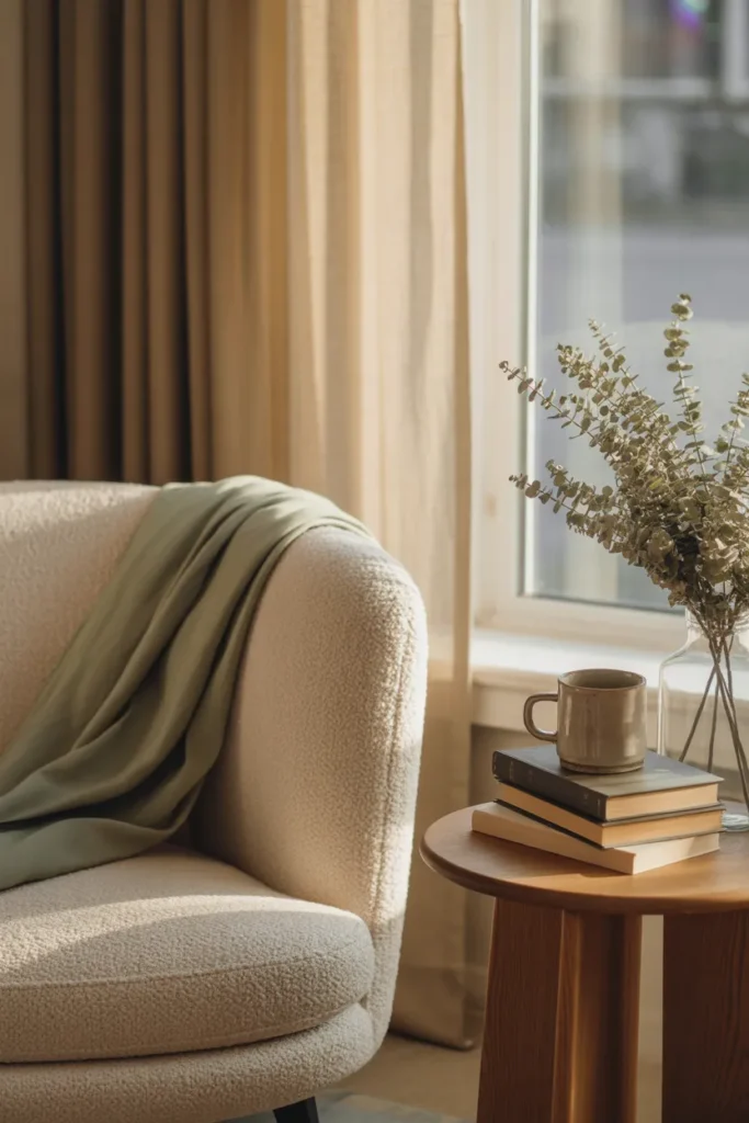
Who This Post Is For
This guide is for renters who can’t paint, homeowners who can, small-space dwellers working with a 4 by 6 foot corner, and anyone who has saved 80 reading nook pins and still can’t pick a direction. If you read for mood (and most of us do), you’ll find a palette here that matches the kind of reader you actually are.
How I Organized These 10 Palettes (the Axis)
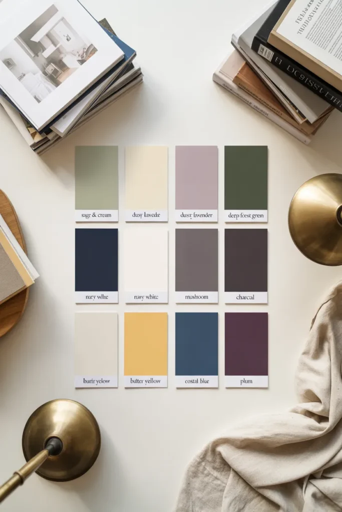
Most articles group palettes by room. That misses the point. You don’t pick a reading nook color scheme based on which wall it’s against. You pick it based on what reading feels like to you. So we’re organizing by reader mood, and each palette is tagged with a style category (Japandi, Cottagecore, Dark Academia, and so on), a 60/30/10 breakdown, hex codes, matching Sherwin-Williams and Benjamin Moore paints, and both a budget and splurge execution path.
The 60/30/10 Rule, Quickly (and How It Changes in a Nook)
The 60/30/10 rule is the cleanest way to build a palette that feels intentional instead of busy. Sixty percent is your dominant color (usually walls and large textiles), 30 percent is your secondary (curtains, chair, rug), and 10 percent is your accent (pillows, art, ceramics, books). In a small reading nook, I shift that slightly: 60 percent dominant on walls and chair upholstery, 30 percent on the rug and curtains, and 10 percent split between two accent colors (a warm one and a cool one) so the space has a little tension. Pure balance is boring. A tiny clash is what makes a nook memorable.
Color psychology research backs this up. Cool colors like blue, green, and soft purple promote feelings of relaxation, tranquility, and calm, which is why they show up in nearly every “best reading nook” mood board. That doesn’t mean your palette has to be cool. It means your dominant 60 percent should pull from a calm family, and your warmer accents can do the emotional lifting.
Palette 1: Sage and Cream (the Slow Sunday Reader)
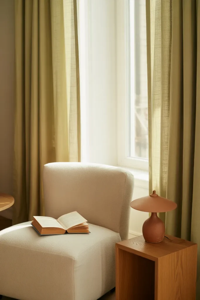
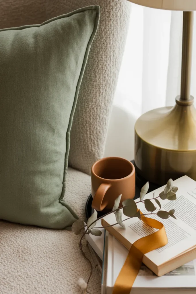
Style: Cottagecore meets Organic Modern Mood: Slow mornings, herbal tea, novels with maps in the front 60/30/10: 60% warm cream walls, 30% sage upholstery and curtains, 10% terracotta and aged brass accents
Hex codes: Cream #F2EBDD, Sage #A8B5A0, Terracotta #C97B5A
Paint matches:
- Sherwin-Williams: Creamy SW 7012 (walls), Evergreen Fog SW 9130 (accent)
- Benjamin Moore: White Dove OC-17 (walls), Saybrook Sage HC-114 (accent)
Why it works: Sage is the most forgiving green on the spectrum. It reads as a neutral in daylight and warms up under lamp light, which makes it perfect for a corner you use both morning and evening. Cream keeps the whole thing from feeling chilly.
How to execute on a budget: A gallon of Behr eggshell from Home Depot runs about $35. Add a sage waffle throw from Target (around $25) and a cream IKEA Strandmon chair you scored secondhand on Facebook Marketplace.
Splurge version: Anthropologie’s Carmela Slipper Chair in cream, Pottery Barn linen curtains in sage, and a hand-thrown terracotta lamp from a small ceramicist on Etsy.
Renter-friendly path: Skip the paint. Use peel-and-stick sage wallpaper on a single accent wall (Chasing Paper has good removable options) and lean a tall cream curtain panel on a tension rod.
Palette 2: Dusty Lavender and Oat (the Poetcore Reader)
Style: Grandmillennial meets Cottagecore Mood: Poetry, journaling, candlelight, rainy afternoons
60/30/10: 60% oat walls, 30% dusty lavender curtains and chair, 10% deep plum and antique gold accents
Hex codes: Oat #E8E0D2, Dusty Lavender #B8A5C4, Deep Plum #5C3D5C
Paint matches:
- Sherwin-Williams: Natural Linen SW 9109 (walls), Wisteria SW 6822 (accent)
- Benjamin Moore: Pale Oak OC-20 (walls), Wood Violet 1391 (accent)
Why it works: This is the Pinterest-trending “cozy purple” lane done for grown adults. Lavender alone can read juvenile. Pair it with warm oat and a heavy plum accent and suddenly it feels like a small library in a Brontë novel.
Budget version: A dusty lavender duvet folded as a throw over your existing chair, oat sheers from IKEA, and a $12 plum candle from Target.
Splurge version: A velvet club chair in muted lavender from CB2, linen oat curtains from Crate & Barrel, and a brass picture light from Schoolhouse Electric.
Renter friendly: All textile. No paint required. Swap your current curtains and add a lavender lumbar pillow plus a plum throw blanket.
Palette 3: Deep Forest and Cognac (the Dark Academia Reader)
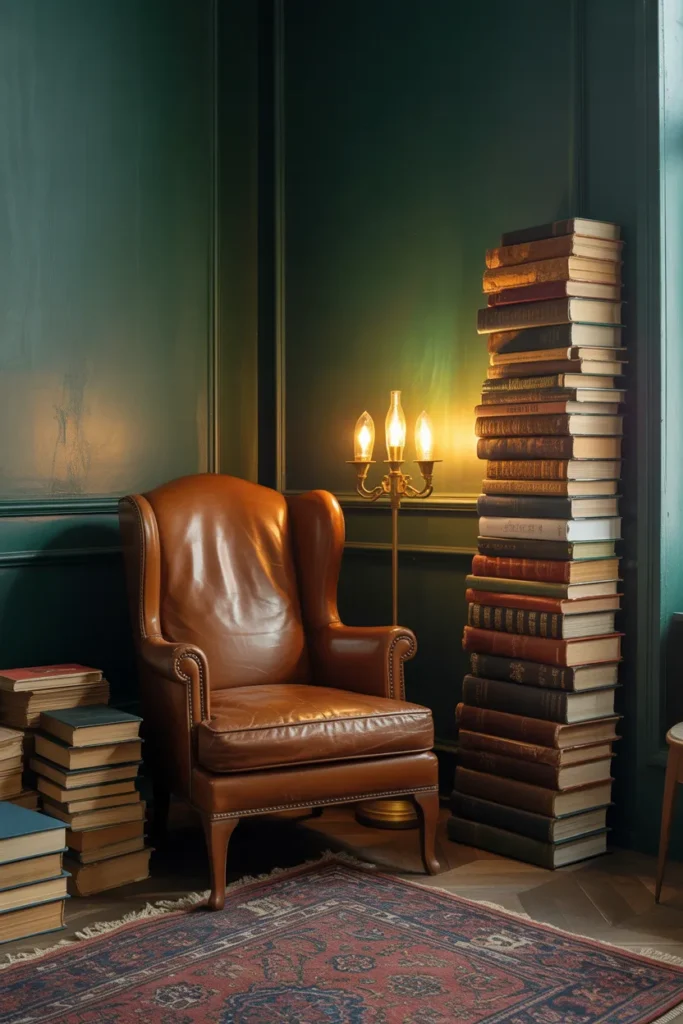
Style: Dark Academia meets Traditional Mood: Leather-bound books, fountain pens, autumn rain, philosophy at midnight
60/30/10: 60% deep forest walls, 30% cognac leather chair, 10% antique brass and ivory paper accents
Hex codes: Deep Forest #2F3E2E, Cognac #8B5A3C, Ivory #F0E8D6
Paint matches:
- Sherwin-Williams: Pewter Green SW 6208 (walls), Rookwood Dark Brown SW 2808 (accent)
- Benjamin Moore: Forest Floor 2034-20 (walls), Bison Brown 2161-20 (accent)
Why it works: Dark walls make a small nook feel intentional instead of cramped. The trick is contrast: a deep matte green wall, a saddle-leather chair, and one bright ivory element (a vintage lampshade, a stack of paper-jacketed books) to keep your eye moving.
Budget version: Paint a single accent wall behind the chair in Behr’s Cracked Pepper. Pair with a thrifted brown leather chair (always cheaper than new) and a goose-neck task lamp from Amazon.
Splurge version: A Restoration Hardware Maxwell leather chair in chestnut, color-drenched walls and trim in Farrow & Ball’s Studio Green, a brass swing-arm sconce from Visual Comfort.
Renter friendly: A dark green velvet curtain panel hung floor to ceiling creates the same visual weight as a dark wall, with zero paint commitment.
Palette 4: Warm White and Terracotta (the Sunny Rom-Com Reader)
Style: Organic Modern meets Coastal Mood: Beach reads, summer afternoons, optimistic plots with happy endings
60/30/10: 60% warm white walls, 30% natural oak and rattan, 10% terracotta and soft olive accents
Hex codes: Warm White #F5EFE6, Terracotta #C97B5A, Soft Olive #8B8B5E
Paint matches:
- Sherwin-Williams: Alabaster SW 7008 (walls), Cavern Clay SW 7701 (accent)
- Benjamin Moore: Simply White OC-117 (walls), Audubon Russet HC-51 (accent)
Why it works: Warm white is the friendliest palette anchor on earth. It bounces natural light, plays well with wood tones, and gives terracotta a chance to feel grounded instead of dated. This palette is what people actually mean when they say “California cozy.”
Budget version: Behr’s Swiss Coffee on the walls, a $30 terracotta planter from Target, and a thrifted rattan armchair re-cushioned with linen seat pads.
Splurge version: A bouclé swivel chair from Crate & Barrel, custom linen Roman shades, a vintage Moroccan rug from a dealer.
Renter friendly: Most rentals already have warm white walls. Lean into them with a terracotta jute rug and an olive-tone throw.
Palette 5: Navy and Brass with Ivory (the Classic Bookworm)
Style: Traditional meets Grandmillennial Mood: Hardcover novels, leather bookmarks, the smell of a used bookstore
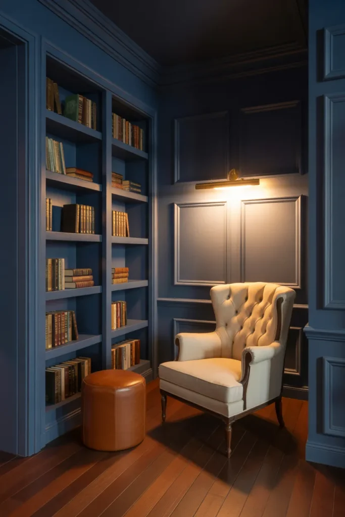
60/30/10: 60% navy walls, 30% ivory bookshelves and chair, 10% brass hardware and cognac accents
Hex codes: Navy #1F2D3D, Ivory #F0E8D6, Brass #B5904B
Paint matches:
- Sherwin-Williams: Naval SW 6244 (walls), Creamy SW 7012 (shelves)
- Benjamin Moore: Hale Navy HC-154 (walls), White Dove OC-17 (shelves)
Why it works: Navy is the most underused color in cozy reading nooks because everyone assumes dark equals cave. With ivory shelves and brass hardware, navy reads as elevated and library-like. This is the palette that ages best, by a long shot.
Budget version: Paint one wall in navy, build IKEA Billy bookcases in white, add brass knobs from Hobby Lobby.
Splurge version: Built-in millwork painted in Benjamin Moore Hale Navy, brass library sconces, a tufted ivory roll-arm chair.
Renter friendly: A navy velvet curtain wall behind your chair plus an ivory bookcase pushed alongside it gives you the entire visual effect without paint.
Palette 6: Mushroom and Bone (the Japandi Minimalist)
Style: Japandi meets Minimalist Mood: Quiet focus, slow architecture books, single-flower vases
60/30/10: 60% mushroom walls, 30% bone-toned linen, 10% black oak and matte ceramics
Hex codes: Mushroom #C7BFB1, Bone #E5DED1, Black Oak #2C2620
Paint matches:
- Sherwin-Williams: Accessible Beige SW 7036 (walls), Tony Taupe SW 7038 (accent)
- Benjamin Moore: Edgecomb Gray HC-173 (walls), Bennington Gray HC-82 (accent)
Why it works: This is the palette that answers “what color is replacing gray?” Mushroom and bone are warm neutrals that read sophisticated without feeling cold the way true gray often does. The Pantone Color of the Year for 2026 is a soft white called Cloud Dancer, which Pantone describes as a calming whisper in a noisy world, and this palette taps directly into that quieter-neutrals movement.
Budget version: Behr’s Wheat Bread on the walls, an IKEA Poäng chair re-upholstered with a bone linen cover, and one Hasami porcelain mug.
Splurge version: Color-drench the whole nook (walls and trim) in Farrow & Ball’s Skimming Stone, add a Hans Wegner-style lounge chair in natural oak, and a single Akari paper lantern.
Renter friendly: A bone linen slipcover on whatever chair you have, plus mushroom-toned curtains, gets you 80 percent of the look.
Palette 7: Charcoal and Blush (the Moody Modern Reader)
Style: Modern meets Transitional Mood: Contemporary fiction, after-dark reading, low lighting
60/30/10: 60% charcoal walls, 30% blush velvet chair, 10% brass and smoke-gray accents
Hex codes: Charcoal #3A3A3A, Blush #E2BFB5, Brass #B5904B
Paint matches:
- Sherwin-Williams: Iron Ore SW 7069 (walls), Intimate White SW 6322 (accent)
- Benjamin Moore: Wrought Iron 2124-10 (walls), Pink Bliss 2093-70 (accent)
Why it works: Charcoal and blush is the contrast palette people don’t expect to love and then can’t stop staring at. The deep wall recedes, the blush chair pops, and brass keeps it warm. This palette photographs unreasonably well, which makes it a Pinterest favorite.
Budget version: Charcoal accent wall, Target’s blush velvet chair under $200, brass-finish floor lamp from Amazon.
Splurge version: Color-drench in Iron Ore, a blush velvet swivel chair from Anthropologie, and a Cedar & Moss brass sconce.
Renter friendly: A charcoal canvas curtain wall plus a blush throw on your existing chair achieves the same drama.
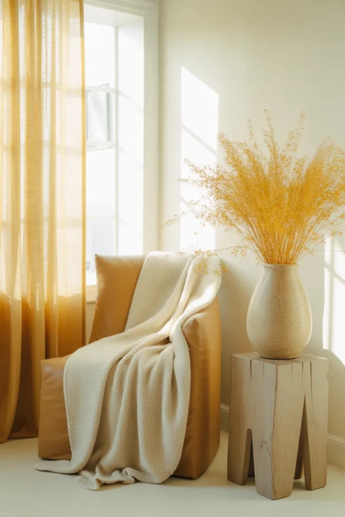
Palette 8: Butter Yellow and Soft White (the Cheerful Optimist)
Style: Transitional meets Modern Farmhouse Mood: Children’s classics, memoirs, morning reading with coffee
60/30/10: 60% soft white walls, 30% butter yellow accents and curtains, 10% caramel oak and dried wheat
Hex codes: Soft White #F8F4ED, Butter Yellow #F4D58D, Caramel Oak #A47148
Paint matches:
- Sherwin-Williams: Greek Villa SW 7551 (walls), Rye SW 6386 (accent)
- Benjamin Moore: White Dove OC-17 (walls), Hawthorne Yellow HC-4 (accent)
Why it works: Butter yellow is having a real moment in 2026 as the warm neutral replacing dusty pinks and grays. It’s the answer to the People Also Ask question “what color is replacing gray?” along with mushroom and oat. Butter yellow brightens a corner without screaming sunshine.
Budget version: Soft white walls (most rentals have this already), a butter yellow boucle throw from HomeGoods, dried wheat in a thrifted ceramic jug.
Splurge version: A custom butter linen reading chair from Sixpenny, hand-loomed wool rug, and an oak side table from Crate & Barrel.
Renter friendly: All textile. Butter yellow lumbar pillow, curtain panels, and a small framed botanical print.
Palette 9: Coastal Fog (the Slow Coastal Reader)
Style: Coastal meets Scandi Mood: Slow novels, ocean memoirs, weekend mornings
60/30/10: 60% pale blue-gray walls, 30% sand and driftwood, 10% navy and ivory shell accents
Hex codes: Pale Blue-Gray #C5D2D6, Sand #D9C9A8, Navy #1F2D3D
Paint matches:
- Sherwin-Williams: Sea Salt SW 6204 (walls), Misty SW 6232 (accent)
- Benjamin Moore: Quiet Moments 1563 (walls), Beach Glass 1564 (accent)
Why it works: Sea Salt is the most-painted coastal color in the country for a reason. It reads gray in some lights, green in others, and blue at golden hour. Paired with sand textiles and a navy accent, you get a nook that feels like a quiet beach house in any climate.
Budget version: Sea Salt paint, sand-colored linen curtains from IKEA, navy stripe pillow from Target.
Splurge version: Pottery Barn slipcovered chair in flax, custom shutters painted in Sea Salt, a vintage navy Persian runner.
Renter friendly: Sand-toned linen curtains and a pale blue-gray throw can fake the wall color from a distance.
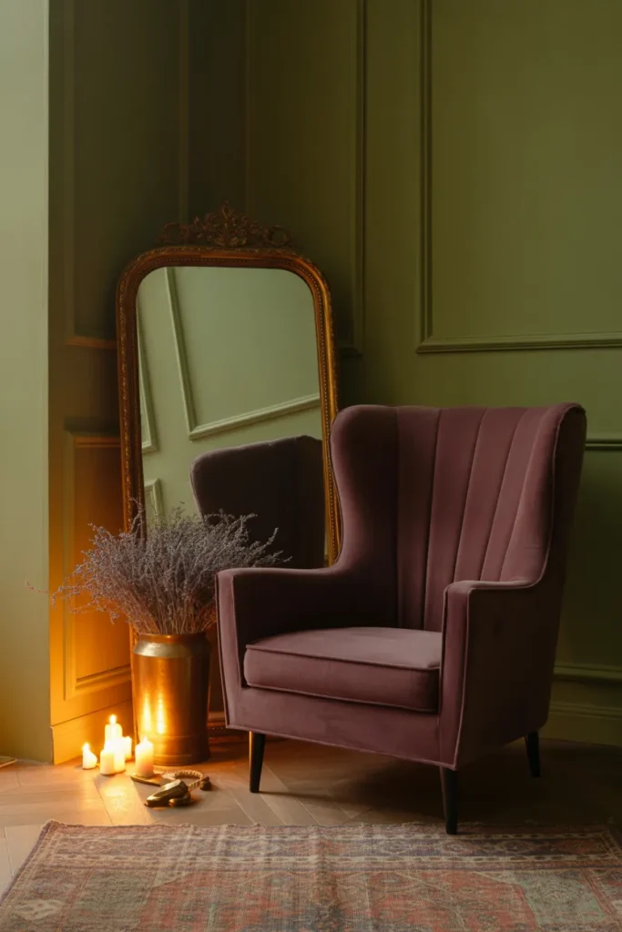
Palette 10: Plum and Sage (the Cozy Purple Reader)
Style: Cottagecore meets Boho Mood: Tarot card decks, fantasy novels, candle-lit late-night reading
60/30/10: 60% sage walls, 30% deep plum chair and curtains, 10% antique gold and dusty rose accents
Hex codes: Sage #A8B5A0, Deep Plum #5C3D5C, Antique Gold #B5904B
Paint matches:
- Sherwin-Williams: Evergreen Fog SW 9130 (walls), Plum Brown SW 0073 (accent)
- Benjamin Moore: October Mist 1495 (walls), Shadow 2117-30 (accent)
Why it works: This is the grown-up version of the “cozy purple reading nook” search that’s exploding on Pinterest. Sage tempers plum so it doesn’t tip into goth. Together they feel storybook without feeling costume.
Budget version: Sage paint, a deep plum velvet throw, and a gold-rim mirror from HomeGoods.
Splurge version: Color-drenched sage walls and ceiling, a plum velvet swivel chair from Sixpenny, antique brass library sconces.
Renter friendly: Sage curtain panels, plum velvet pillow, and a small gold-framed mirror leaning on the floor.
Budget vs Splurge: One Palette, Two Price Points
Here’s the same Sage and Cream palette executed at two budgets so you can see how the choices stack up.
Budget build (under $300 total):
- Behr Marquee paint in Even Better White (1 gallon, $48)
- Target Threshold sage waffle throw ($25)
- IKEA Strandmon chair, second-hand on Marketplace ($120)
- Target oak veneer side table ($45)
- HomeGoods terracotta vase ($20)
- Amazon brass-finish floor lamp ($40)
Splurge build (around $2,500):
- Farrow & Ball School House White (2 gallons, $240)
- Anthropologie Carmela slipper chair in cream ($1,398)
- Pottery Barn linen curtains in sage ($280)
- Schoolhouse Electric brass floor lamp ($459)
- Hand-thrown terracotta lamp base from Etsy ($140)
Same palette, same vibe, very different price tag. Both work.
Lighting Color Temperature: the Palette Element Everyone Forgets
A perfect paint color can look horrible under the wrong bulb. The fix: warm white bulbs in the 2700K to 3000K range for everything in your reading nook. Anything 4000K or higher pulls the warmth out of your palette and makes the whole space feel like a hotel lobby. If you want to go deep on the lighting side, our reading nook lighting ideas post breaks down ambient, task, and accent layers in detail.
ADHD-Friendly Reading Nook Colors
If focus is hard for you, your palette has a real job to do. Color psychology research suggests that green reduces eye strain and promotes a sense of balance, making it perfect for spaces where concentration and relaxation are equally important. Sage, mushroom, and soft blue-gray (the palettes above numbered 1, 6, and 9) are the strongest options for ADHD-friendly reading. Avoid high-contrast palettes (charcoal and blush, navy and ivory) if you’re using the nook specifically to settle racing thoughts.
Common Mistakes to Avoid
- Choosing wall color before chair color. The chair is the visual anchor of a reading nook. Pick it first, then build the wall and accent palette around it.
- Using cool white LED bulbs. Even a gorgeous warm palette dies under a 4000K bulb. Switch every bulb in the nook to 2700K.
- Skipping the test swatch. Paint a 2-by-2 foot board, lean it against the wall, and look at it morning, afternoon, and lamp-lit night. Colors shift dramatically through the day.
- Forgetting the ceiling. White ceilings can flatten a moody palette. In a small nook, paint the ceiling the same color as the walls (color drenching) to make it feel bigger and more cocoon-like.
- Going too matchy. A perfectly coordinated palette feels staged. Throw in one thrift-store piece in an unexpected color (a vintage book in a clashing jacket, a yellow ceramic) to make the whole thing feel collected.
- Ignoring undertones. A cream with pink undertones will fight a sage with yellow undertones. Hold every swatch next to your chair fabric before you buy.
Quick Reference Table
| Palette | Style | Best For | Renter Friendly |
|---|---|---|---|
| Sage and Cream | Cottagecore | Slow readers | Yes |
| Dusty Lavender and Oat | Grandmillennial | Poetry lovers | Yes |
| Deep Forest and Cognac | Dark Academia | Night readers | Curtains only |
| Warm White and Terracotta | Organic Modern | Light-filled rooms | Yes (most rentals) |
| Navy and Brass | Traditional | Classic libraries | Curtains only |
| Mushroom and Bone | Japandi | Minimalists | Yes |
| Charcoal and Blush | Modern | Moody readers | Curtains only |
| Butter Yellow | Modern Farmhouse | Cheerful readers | Yes |
| Coastal Fog | Coastal | Calm seekers | Yes |
| Plum and Sage | Boho | Fantasy readers | Yes |
How to Style Each Palette
The palette is half the work. The styling is the other half. Three rules that hold across every palette above:
Layer three textures minimum. Linen, wool, and ceramic. Or velvet, leather, and brass. Texture is what makes a palette feel cozy instead of flat in photos.
One organic element. A trailing plant, dried branches, a real flower. Living material softens a palette no matter how restrained.
One imperfect object. A thrifted lamp, a hand-thrown mug, a worn book. Perfect rooms feel like waiting rooms.
If you’re still building out the full nook from scratch, our ultimate guide to building a reading nook in any room walks through location, seating, and storage before you ever pick paint. For bedroom-specific layouts, the bedroom reading nook ideas post has 18 setups across every style covered above.
Frequently Asked Questions
What is the 60/30/10 color rule?
The 60/30/10 rule is a designer formula for balanced palettes. Sixty percent of your space is a dominant color (usually walls), 30 percent is a secondary color (usually large furniture and textiles), and 10 percent is an accent color (pillows, art, ceramics). For a small reading nook, I recommend tweaking the 10 percent into two smaller 5 percent accents so you get a warm and cool note in the same space.
What are the best colors for a reading room?
The strongest reading room colors are warm sages, mushroom neutrals, soft blue-grays, and warm whites. These tones reduce visual strain, work under warm task lighting, and pair easily with wood and brass. If you want a moodier reading room, deep forest green and navy are the most forgiving dark colors in low light.
What color is replacing gray?
Warm neutrals are pushing cool gray out of cozy interiors. Mushroom, oat, soft cream, and butter yellow are leading the shift in 2026. Pantone’s 2026 Color of the Year, Cloud Dancer, is a soft warm white that signals the same direction. Sage green is also being used as a neutral in places gray used to live.
What colors help people with ADHD focus?
Soft greens (especially sage and eucalyptus), warm mushroom neutrals, and pale blue-grays are the most consistently recommended colors for focus. They reduce visual noise, lower stimulation, and pair well with the dim task lighting most ADHD-friendly reading nooks already use. Avoid high-contrast palettes and saturated reds or oranges in spaces meant for settling.
How do I do a reading nook color palette in a rental?
Skip paint entirely. Use peel-and-stick wallpaper on one accent wall (Chasing Paper and Tempaper are landlord-safe), hang floor-to-ceiling curtain panels in your dominant color to fake a painted wall, and let textiles do the rest. A throw, two pillows, a rug, and a curtain in your palette colors carry 90 percent of the visual weight of paint.
What is the budget version of a reading nook color palette?
A full budget palette under $200 looks like: $35 on a gallon of Behr paint or $40 on peel-and-stick wallpaper, $40 to $80 on a thrifted or Facebook Marketplace chair, $25 on a throw blanket from Target, $20 on two pillows from HomeGoods, and $20 to $30 on a curtain panel from IKEA. The trick is letting two or three textile pieces carry the entire palette.
What if I don’t have a window in my reading nook?
You replace natural light with layered warm lighting. Aim for three light sources at three different heights: a floor lamp behind the chair, a small table lamp at elbow height, and a string light or sconce overhead. Use 2700K bulbs in all three. A windowless nook can be cozier than a sunlit one if you commit to the lighting.
How long does it take to set up a reading nook color palette?
A textile-only renter palette can be done in an afternoon. A painted single-accent-wall palette takes one weekend (a day to paint, a day to dry and style). A full color-drenched nook with new furniture takes about two weekends from paint to final styling.
Save This Post and Pick Your Palette
Pick the palette that matches the kind of reader you are right now, not the kind of reader you wish you were. The Slow Sunday Reader, the Dark Academia Reader, the Cozy Purple Reader. They all earn the same cozy corner. The right colors just make sitting down in it feel inevitable.
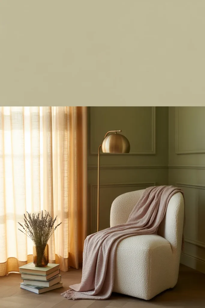
📌 Pin the sage and cream image (Image 2 above) for the most-saved palette of the bunch, or save this whole post for when you finally pick up a paint brush.
If you’re still figuring out where to put the nook in the first place, the ultimate guide to building a reading nook in any room is the natural next read. And once your palette is set, swing over to the reading nook lighting ideas post to get the glow right.
Which palette caught your eye first? That’s usually the one to build.
Keep reading
More cozy nook ideas
 Fall Decor
Read →
Fall Decor
Read →
Holiday Decor on a Budget: Where to Spend and Where to Save
If last December’s holiday decor money went to plastic picks, a glitter sign, and a box of red balls you were tired…
 Fall Decor
Read →
Fall Decor
Read →
21 Vintage Pumpkin Ideas for Small Apartments, No Porch or Nails Needed
No porch, no mantel, and a lease that frowns on nail holes. You still get a fall corner. You need one shelf,…
 Fall Decor
Read →
Fall Decor
Read →
14 Witchy Backyard Ideas for a Whimsical, Storybook Halloween
No old oak grove, no permission to dig, no money for a garden cottage. A witchy backyard still fits. You need one…
One Comment