
Warm Neutral Home Decor That Reads Soft, Not Flat

Your room is beige. It is also, somehow, a little sad. That gap between “warm neutral home decor” on Pinterest and the oatmeal-colored nothing in your living room is not a taste problem, and it is not a budget problem. It is a depth problem, and it takes three tones and one bulb swap to fix. Below is the rule we use before buying anything, the paint codes that actually pair, and a version that costs under $150 and needs zero landlord permission.
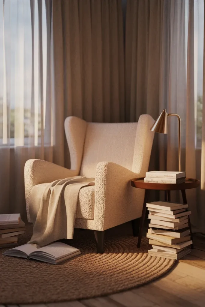
The Three-Depth Rule (start here, before you buy anything)
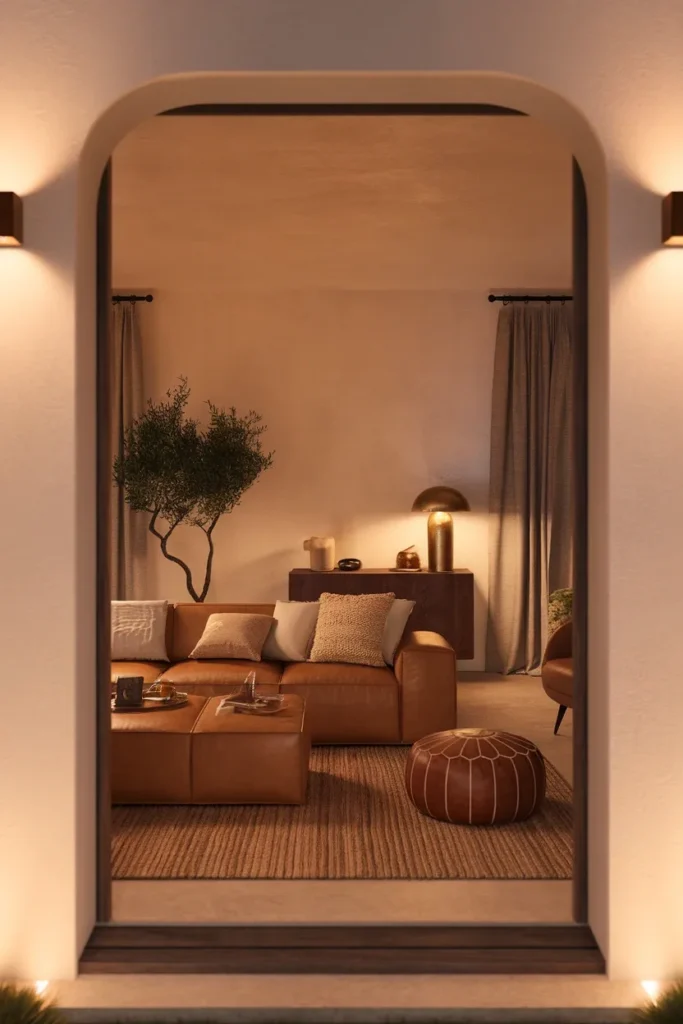
Here it is, in one line: a warm neutral room needs three depths of the same undertone, plus one texture that isn’t flat.
Pale. Mid. Deep. All leaning the same direction on the color wheel. Miss any one of the three and the room goes soft in the wrong way.
Most beige rooms that feel flat have only two depths, and both of them are pale. That’s the whole problem. There’s nothing for your eye to land on, so the space reads as unfinished rather than restful.
Here’s the rule applied with real, current paint codes so you can take it straight to the store:
| Depth | Coverage | What it lives on | Real examples (verified August 2026) |
|---|---|---|---|
| Pale | ~70% | Walls, ceiling, trim, sheer curtains | Benjamin Moore Swiss Coffee OC-45, Sherwin-Williams Cream and Sugar SW 9507 |
| Mid | ~20% | Sofa, armchair, rug, bench cushion | Sherwin-Williams Universal Khaki SW 6150, Benjamin Moore Sherwood Tan 1054 |
| Deep | ~10% | One anchor piece: a leather pouf, a walnut shelf, a dark frame, a wool throw | Benjamin Moore Silhouette AF-655, Sherwin-Williams Dark Auburn SW 6034 |
The deep 10% is the part everyone skips. It’s also the part that makes the photo work.
And the texture requirement is not decorative fluff. Two surfaces in identical cream, one in boucle and one in flat cotton, will read as two different colors under the same lamp. That’s free contrast.
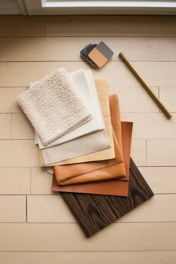
What Actually Makes a Neutral “Warm”
Undertone. That’s the entire answer, and it’s the reason two beiges from two brands can fight on the same wall.
A warm neutral carries yellow, red, or golden brown underneath the surface color. A cool neutral carries blue, green, or violet. Both can look like “beige” on a 2-inch chip in a store with fluorescent overheads.
The clearest proof of what the industry means by warm right now comes straight from the manufacturers. The Sherwin-Williams 2026 color of the year is Universal Khaki SW 6150, which the brand itself describes as a mid-tone neutral with a slight yellow undertone. That yellow lean is the whole definition, stated plainly by the people who mixed it.
Benjamin Moore went deeper for the same year with Silhouette AF-655, a burnt umber with charcoal in it. Different depth, same warm family.
So when you’re building a warm toned house decor scheme, you’re not picking colors that look warm. You’re picking colors that share an undertone and then arranging them by depth.
Greige, for the record, is the fence-sitter. Some greiges lean warm and some lean cool, and the label on the can will not tell you which. Test it.
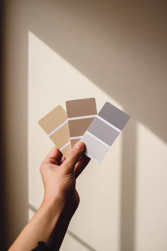
The White Paper Test: Diagnose What You Already Own
Nobody starts from empty. You’ve got a sofa, a rug, and trim you didn’t choose, and one of them is quietly fighting the rest.
Here’s how to find the culprit in about four minutes:
- Grab a sheet of plain printer paper. Standard copy paper is a cool, blue-leaning white, which makes it a useful reference.
- Hold it flat against each surface, one at a time, in daylight near a window. Not under a lamp.
- Watch what happens to the surface, not the paper. If the item suddenly looks yellow, tan, or peachy next to the paper, it’s warm. If it looks blue, purple, or ashy, it’s cool.
- Write down which pieces landed in which column.
Now count. If your list is lopsided, meaning four warm items and one cool, the single cool item is what’s making the room feel off. Swap or slipcover that one thing before you repaint anything.
That last part matters, because most people repaint first. Paint is the biggest, most expensive surface in the room and usually not the actual offender.
The most common failure we see: warm cream walls with a cool gray rug. Every time. The rug pulls the whole floor plane blue and the walls start looking dingy instead of soft.

Your Bulb Is a Decor Decision
You can get every color right and still lose the room at the light switch.
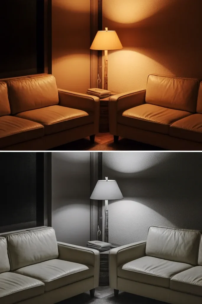
Light color is measured in Kelvin, and the number is printed on every bulb box in America. The Department of Energy lighting color guidance puts it in plain numbers: 2700 to 3000K reads warm, 3600 to 5500K reads cool, and 2700 to 3600K is what’s recommended for most indoor general and task lighting.
Translated into what it does to your beige:
| Bulb label on the box | Kelvin | What it does to warm neutrals |
|---|---|---|
| Soft white / warm white | 2700K | Cream reads creamy, wood grain warms up, tan looks like tan |
| Warm white | 3000K | Still warm, slightly crisper, good for a task lamp |
| Bright white / neutral | 3500-4000K | Greige tips gray, cream goes dull, boucle loses its glow |
| Daylight | 5000K+ | Warm neutrals look washed out and faintly clinical |
Stay at 2700K for anywhere you curl up. A 5W dimmable 2700K E26 bulb from IKEA runs about $4.99 for a two-pack as of August 2026, which makes this the cheapest color correction in decorating.
One more thing that costs nothing: put your light low. Two lamps at chair height and shoulder height beat one ceiling fixture, because overhead light flattens texture and texture is doing half the work in a neutral room.
If you want this worked out for a specific corner, our bedroom reading corner setups walk through lamp placement with the actual heights.
Five Rules for a Warm Neutral Room That Doesn’t Go Flat
Front-loaded, most useful first.
1. Buy the deep 10% before the pale 70%. Anchor first. A walnut stool or a caramel leather pouf gives every pale thing you add afterward something to sit against. Pick the pale stuff first and you’ll keep buying more pale stuff.
2. Use three textures minimum in every sightline. Boucle, jute, linen. Or sheepskin, raw wood, wool. Flat-plus-flat reads as cheap even in expensive fabric.
3. Follow the 18-inch reach rule for side tables. Whatever you’re sitting in, your mug should land within about 18 inches of your shoulder without leaning. Farther than that and you’ll set the mug on the floor, which is how nooks stop getting used.
4. Let one metal repeat exactly three times. Brass on the lamp, the frame hook, and a small tray. Three is enough to look intentional and few enough to look calm. Brass is also having a real moment right now: Pinterest’s 2026 trend report clocked “brass aesthetic” searches up 35%.
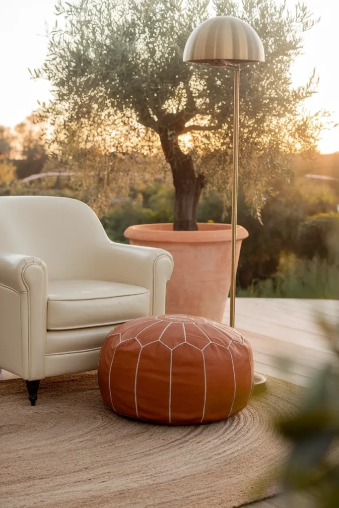
5. Add one living thing. An olive tree, a pothos, dried grasses. Green is the one non-neutral that never fights a warm palette, because it’s already in the tan family’s neighborhood.
That’s the whole system. Everything below is just applying it to a real corner.
Three Shoppable Archetypes (with real dimensions)
Pick the one that matches your square footage, not the one that matches your Pinterest board.
The Armchair Corner (best for 600 to 1,000 sq ft)
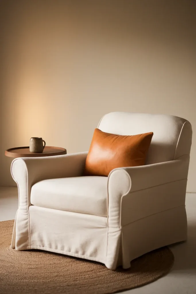
An IKEA POÄNG is the workhorse here, $249 as of August 2026, measuring 26 3/4 inches wide by 32 1/4 inches deep, with a 16 1/2-inch seat height. That seat height matters: it’s close to standard dining chair height, so a 22 to 24-inch side table sits right for a mug without you reaching down.
Swap the cover to a warm oatmeal, add a caramel leather lumbar pillow as your deep 10%, and put a jute rug underneath so the pale floor doesn’t swallow the chair.
Footprint needed: about 4 feet by 4 feet including the rug overhang.
The Floor Cushion Nook (best for under 600 sq ft, or a bay window)
A 30-inch floor cushion, a wool pouf, one bolster, and a washable low-pile rug. No furniture legs means no visual clutter, which is why this reads calm in a studio.
Trade-off honesty: floor cushions photograph beautifully and are hard on your lower back past about 40 minutes. Put a wall or a bookcase behind you so you have something to lean into, or this becomes a spot you admire and never sit in.
The Bench Under the Window (best for a dedicated wall or an awkward alcove)
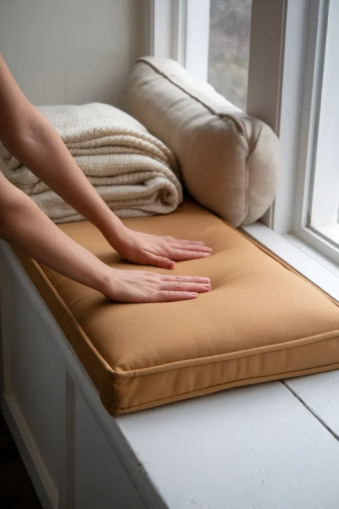
A bench cushion in mid-depth tan, two cream lumbar pillows, cafe curtains in unlined linen, and a picture light or plug-in sconce above. If you’re building rather than buying, several of our budget IKEA nook builds use a KALLAX laid on its side as the bench base, which lands the seat around 16 inches and gives you cubbies for the TBR pile.
The $150 No-Paint Version for Renters
Every archetype above assumes you can buy furniture. This one doesn’t, and nothing here touches a wall.
Warm neutral is genuinely the friendliest palette for renters, because it works with landlord beige instead of fighting it. You are not covering anything. You’re adding the two depths the builder skipped.
The build, in order of impact:
- Bulbs first, about $10. Two 2700K dimmable bulbs. This alone changes the color of every surface in the room.
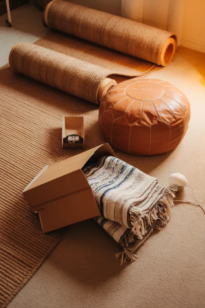
- One deep anchor, $40 to $70. A caramel or dark brown leather pouf, or a walnut-toned stool. This is your 10%.
- A jute or wool-blend runner, $40 to $60. It warms the floor plane and hides cool-toned carpet, which is the most common rental problem.
- Two textures in throws and pillows, $30 to $50. One nubby (boucle, sherpa), one smooth (washed linen). Thrifted counts and often looks better.
Total lands right around $150 at current US prices, and every item leaves with you.
Skip step one and the other three will underperform. That’s the failure mode: people buy the textiles, keep the 4000K bulb the landlord installed, and wonder why their oatmeal throw looks gray.
For more rental-safe moves in this vein, we’ve got a full set of renter friendly cozy apartment ideas with the same no-drill constraint.
Where Warm Neutral Rooms Go Wrong
Four failure modes, all fixable.
Everything is the same depth. Diagnosed by squinting at a photo of the room on your phone. If it turns into one continuous blob, you’re missing the deep 10%.
Cool metals in a warm room. Chrome and polished nickel go blue under 2700K light. Brass, bronze, and matte black stay put.
Too many patterns, not enough texture. Pattern is visual noise in a tonal room. Texture is the version that photographs well and still feels calm in person.
Wall art that’s the wrong temperature. A black and white print with a cool gray mat will drag a whole warm wall toward gray. Cream mats and warm wood frames instead.
That squint test is worth doing before you buy anything else. Phone camera, squint, look for the anchor.
Warm Neutral Home Decor FAQs
What are warm neutral colors? Neutrals that carry a yellow, red, or golden brown undertone rather than a blue, green, or violet one. Cream, oatmeal, tan, camel, khaki, mushroom, and warm greige all qualify. Sherwin-Williams describes its 2026 color of the year, Universal Khaki SW 6150, as a mid-tone neutral with a slight yellow undertone, which is a clean example of the category.
What’s the difference between beige, cream, and greige? Cream is a white with yellow in it, so it’s the palest and always warm. Beige is a light tan, usually warm. Greige is beige with gray added, and it can lean either direction depending on the mix. If you’re unsure about a specific greige, run the white paper test on it before you commit.
What colors go with warm neutrals? Olive and sage green, terracotta, rust, dusty rose, and any wood tone. Sherwin-Williams pairs Universal Khaki with White Snow SW 9541, Cream and Sugar SW 9507, Henna Shade SW 6326, and Dark Auburn SW 6034, which gives you a pale, a mid, and two deeps to choose from.
How do you decorate with neutrals without it looking boring? Add depth and texture rather than more color. Three tonal depths, three textures per sightline, and one deep anchor piece. Boring almost always means everything in the room is the same lightness.
What’s the best warm neutral paint color? There isn’t one best, because the right pick depends on how much natural light your room gets and which direction the windows face. The names that come up repeatedly from designers are Benjamin Moore White Dove, Swiss Coffee OC-45, Balboa Mist, and Shaker Beige, plus Farrow & Ball Drop Cloth and Matchstick. Sample all of them on your own wall for a full day before deciding.
Are warm neutrals replacing gray? The paint industry has clearly moved that way. Both Sherwin-Williams and Benjamin Moore chose warm colors for 2026, Universal Khaki SW 6150 and Silhouette AF-655 respectively, and neither is in the gray family.
Do I need to repaint to get a warm neutral room? No. Bulb color temperature, a warm-toned rug, and one deep anchor piece will shift the perceived color of a room substantially without touching the walls. Start there and repaint only if it still reads cool.
Start With the Bulb
If you do one thing from this whole guide, make it the 2700K swap. It costs about five dollars, takes two minutes, and it’ll tell you immediately whether your existing pieces were warm all along or whether you have a cool-toned rug to deal with.
Then find your deep 10%. That’s the piece the room’s been missing.
When you’re ready to turn the corner into an actual sitting spot rather than a pretty vignette, our nook guides go into the layout, the seat heights, and the lighting placement in detail.
Keep reading
More cozy nook ideas
 Decor and Styling
Read →
Decor and Styling
Read →
Terracotta Reading Nook Ideas That Feel Warm, Not Orange
You rent, you have one weird corner, and you fell for a terracotta reading nook on Pinterest at 11 pm in bed.…
 Decor and Styling
Read →
Decor and Styling
Read →
Blue Reading Nook Ideas for a Calm Corner
Your reading spot right now is probably one dented throw pillow and a stack of books sliding off the windowsill. This fixes…
 Decor and Styling
Read →
Decor and Styling
Read →
Your Green Reading Nook, Three Ways: Sage, Olive, and Forest
If your reading corner right now is a lamp you never turn on and a stack of books doubling as a side…