
Terracotta Reading Nook Ideas That Feel Warm, Not Orange

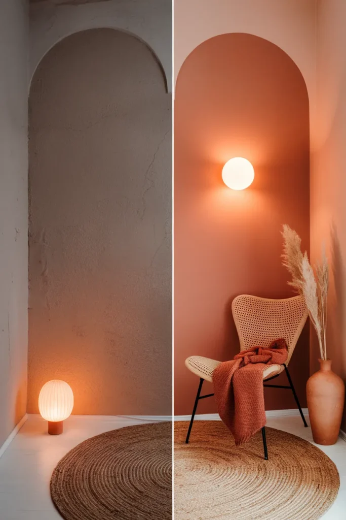
You rent, you have one weird corner, and you fell for a terracotta reading nook on Pinterest at 11 pm in bed. Same. Here is the honest version of that pin: three color moves, one good bulb, and a corner you can build this weekend without a drill or a deposit fight. Warm and sun-baked, not traffic-cone orange. Let’s pick your terracotta first, because that one choice decides everything after it.
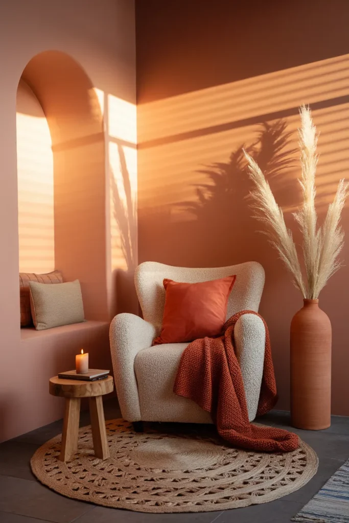
Your 3-Move Terracotta Reading Nook (Cash the Pin Right Here)
Here is the whole thing on the first scroll, so you know exactly what you’re building before you read another word.
- The color, on a surface you’re allowed to change. A terracotta throw pillow, a rust jute rug, or a peel-and-stick swatch behind the chair. Renters, this is your paint.
- A warm seat that softens the clay. Cream boucle, natural rattan, or a caramel armchair. The soft neutral keeps terracotta from taking over.
- A 2700K bulb on a plug-in sconce or swing-arm lamp. Most people skip this, and it’s the piece that makes the corner glow at 9 pm instead of looking flat.
That’s the build. If your pin promised earthy and cozy, those three moves deliver it. Everything below is just how to do each one well, plus the mistake that wrecks the look.
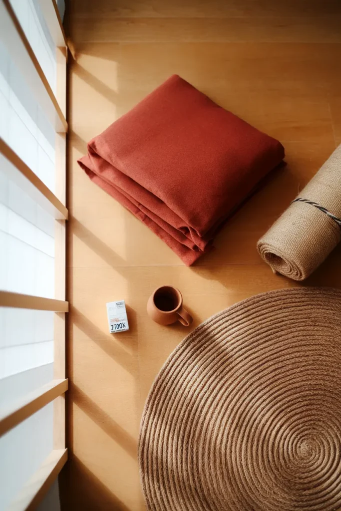
Pick Your Terracotta First: Clay vs Rust vs Burnt Sienna
Terracotta isn’t one color. It’s a family, and the version you pick sets the whole mood of your terracotta reading corner. Decide this in the next thirty seconds so every other purchase gets easier.
Clay / soft terracotta leans pink-beige and reads calm and japandi-quiet. Great for small rooms because it recedes.
Rust is deeper and more saturated, the cozy autumn one most pins are actually showing.
Burnt sienna pushes toward brown-red, moody and closer to dark academia.
If you want a paint reference to match a swatch against, Benjamin Moore’s Baked Terra Cotta 1202 is a solid middle-of-the-family anchor, described by the brand as having grounding orange and brown undertones. Hold a chip next to your rug and your throw before you commit to anything bigger.
One rule that saves you: match undertones, don’t match names. A “terracotta” pillow from one shop and a “terracotta” rug from another can clash hard because one runs pink and one runs orange. Buy them in the same light, or return one.

The Terracotta Trap: How to Keep It Earthy, Not Orange
This is the part no one warns you about, so here it is. Too much pure terracotta, on the walls plus the chair plus the rug plus the pillows, and your cozy corner turns into the inside of a clay pot. It stops reading warm and starts reading loud.
The fix is the 60-30-10 rule, terracotta edition. Roughly 60% quiet neutral (cream, oatmeal, warm white), 30% supporting earth tone (caramel, warm wood, jute), and only about 10% true terracotta as the pop. Your terracotta is the accent, not the base.
Grounding it with green helps too. Sage or olive sits opposite terracotta and instantly reads intentional instead of monochrome. If you want to see how a green base plays with warm accents before you buy, our guide to a sage, olive, and forest green reading nook breaks down all three tones. Terracotta plus olive is the combination that quietly does the most work.
Failure mode: skip this ratio and you’ll feel vaguely annoyed in the corner without knowing why. That “why” is almost always too much orange with nothing cool to balance it.
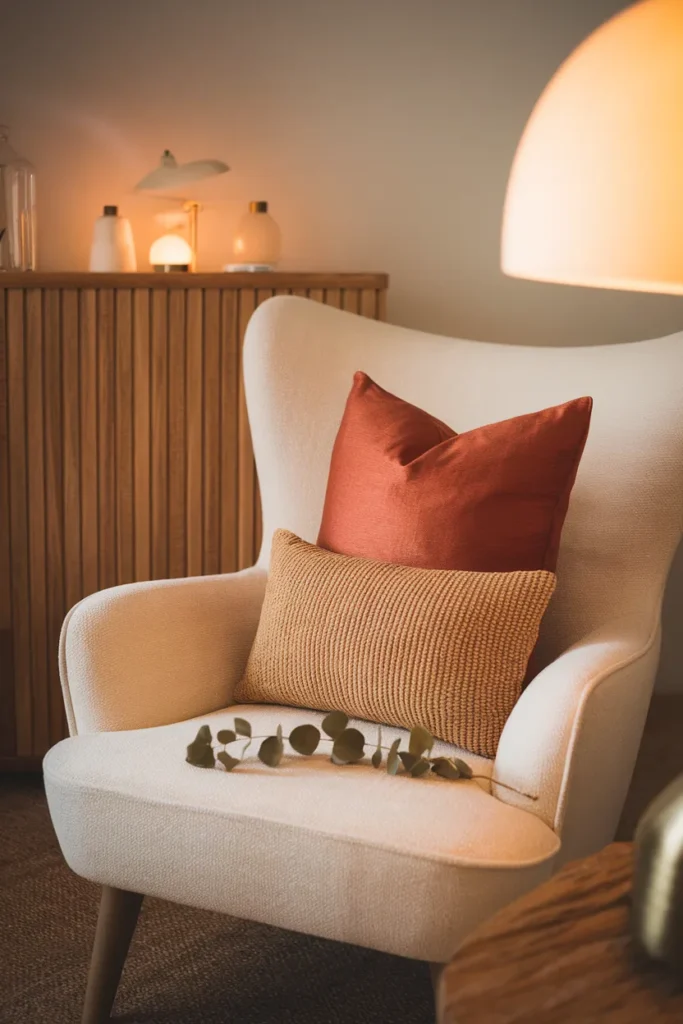
The Renter Move: Terracotta Without Painting a Single Wall
No landlord conversation required. You can get the entire terracotta wash without opening a paint can, and honestly the textile version is cozier anyway because it adds texture the paint can’t.
- A terracotta throw and lumbar pillow on a neutral chair. Fastest, cheapest, fully reversible.
- A rust or clay washable rug, ideally a round jute or a low-pile runner, to ground the corner from the floor up.
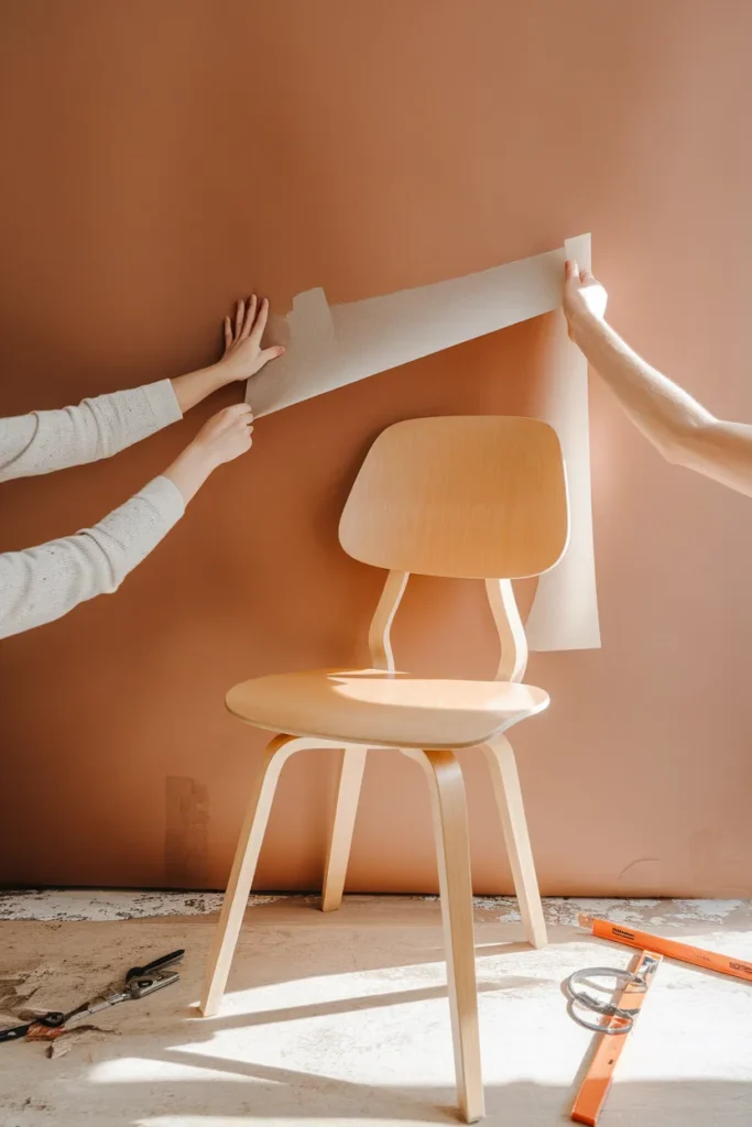
- Peel-and-stick paint swatches or removable wallpaper in a warm clay, in just the nook zone, not the whole room.
- Real clay objects: a rounded terracotta vase with pampas, a stack of unglazed bowls, a small planter. The material itself carries the color.
This layered, earthy approach is the backbone of boho styling, so if you want more corner-by-corner combinations to steal, the boho reading nook ideas post organizes them by the exact kind of space you’re working with. The command-hook trick I used to hang a rust tapestry in my 1920s rental without a nail hole.
Sensory beat: unglazed terracotta feels slightly cool and chalky to the touch, which is a big part of why the material reads calm and grounded even though the color is warm.
Seating That Softens the Clay: Boucle, Rattan, or Caramel Leather
Your chair is where terracotta either turns cozy or turns costume. The goal is contrast in texture, harmony in tone.
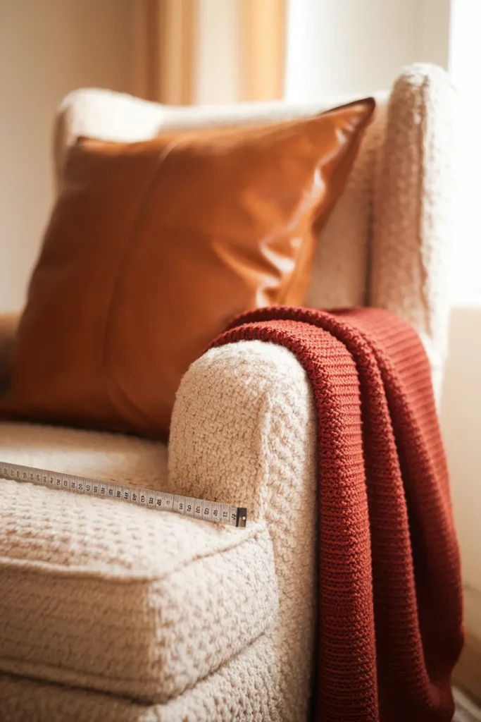
- Cream or oatmeal boucle is the pin favorite for a reason. The nubby white texture cools the warm palette and photographs beautifully in afternoon light.
- Natural rattan or cane brings a lighter, airier, coastal-boho feel and keeps a small nook from feeling heavy.
- Caramel or cognac leather goes full cozy-library, deeper and more dramatic, closer to that dark academia mood.
Whatever you choose, mind the fit. For a genuinely sink-in reading chair, look for a seat depth around 20 to 22 inches (51 to 56 cm) so you can tuck your legs up. Anything shallower and you perch instead of curl. My IKEA Poäng measures roughly 20 inches deep.
Trade-off honesty: floor cushions and poufs photograph incredibly and cost the least, but your lower back will file a complaint after about 40 minutes. If you read for hours, spend on the chair.
Lighting: The 2700K Bulb That Makes Terracotta Glow
Here’s the piece that separates a corner that looks good in a photo from one that feels good at night. Terracotta needs warm light to sing. Under cold, bluish light the whole palette goes muddy and gray.
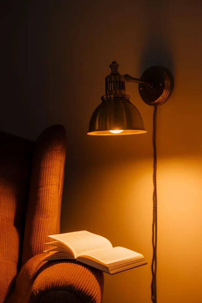
Color temperature is measured in Kelvin, and lower numbers mean warmer, more golden light. The U.S. Department of Energy’s guidance on choosing energy-efficient light bulbs puts the warm, friendly end of the scale right around 2700K, which is exactly what you want glowing on clay tones. Grab a 2700K bulb, add a dimmer if you can, and skip anything labeled “daylight” or “cool white.”
For the fixture, a plug-in wall sconce or a swing-arm lamp beside the chair keeps light on the page instead of in your eyes. Renters, no wiring needed. Our roundup of the best no-wiring reading nook wall sconces covers plug-in and battery picks plus the placement rule worth learning. Position the light beside and slightly behind your shoulder, roughly 15 to 20 inches above the seat, so it lands on the page and not your eyes.
Layer the Softness: Throws, Pillows, and One Chunky Texture
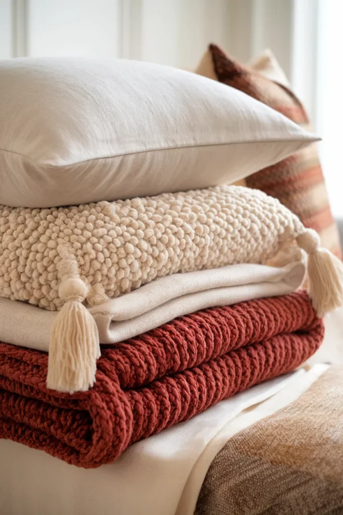
Terracotta reads richer when you stack textures instead of colors. Think one smooth, one nubby, one chunky.
Start with a linen or cotton base pillow, add a boucle or sherpa lumbar for the sink-in factor, then finish with a chunky knit or wool throw in rust or oatmeal tossed over the arm. Don’t fold it. The casual drape is the whole look. A sheepskin underfoot or over the seat adds a fourth texture if the corner still feels flat.
Keep the palette tight: two neutrals, one terracotta, maybe one olive. More colors than that and the cozy tips into cluttered.
Style It Out: Clay Objects, Pampas, and a Small Plant
The finishing layer is what makes people save the pin. Keep it earthy and few.
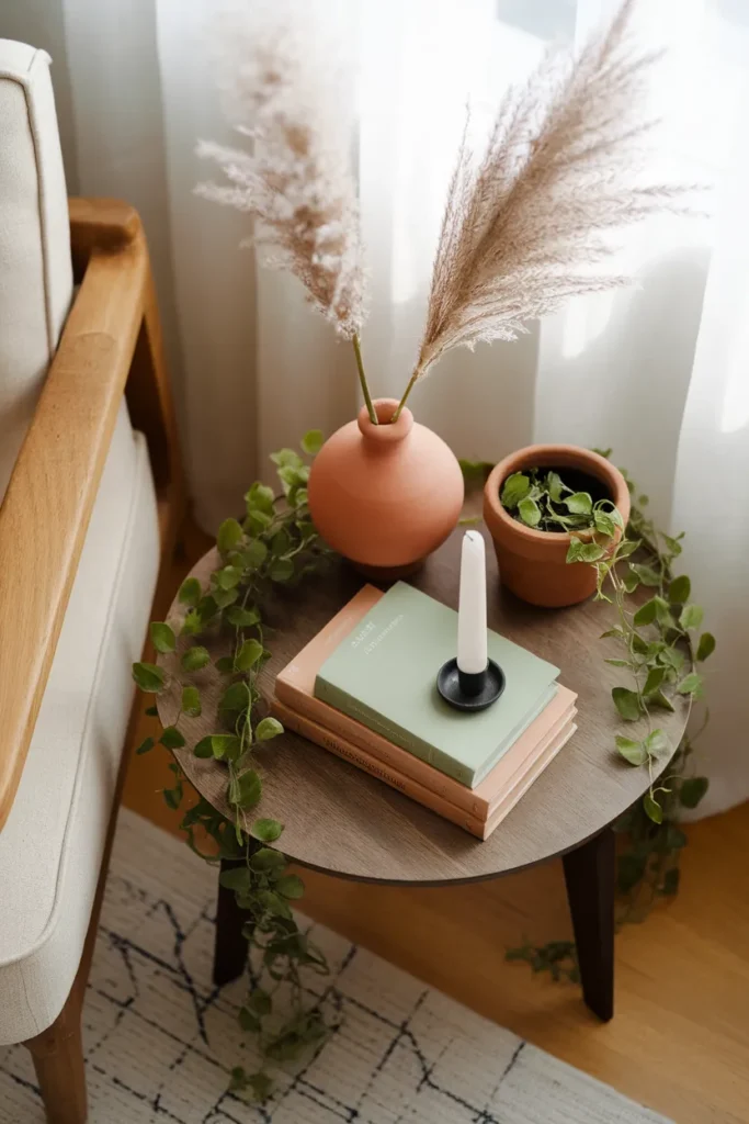
A rounded terracotta or clay vase with a couple of pampas stems is the signature move, straight off the top pins. Add one trailing plant like a pothos for a hit of living green against the warm wall, a small stack of books with worn spines, and maybe a candle for the evening ritual. Group objects in odd numbers and vary the heights.
The rule: every object either earns its spot by being useful or by carrying the terracotta-and-green palette. If it does neither, it’s clutter, and clutter is the fastest way to make a small nook feel smaller.
The Real Numbers: A Terracotta Reading Nook Under $200
Pins love to say “affordable” and then show a $1,200 chair. Here’s an honest, totaled budget corner using thrift and mid-range pieces. Prices are typical 2025 to 2026 US ranges, not a guarantee, so treat them as an estimate and check current pricing.
| Piece | Budget archetype | Typical price band (USD, est.) |
|---|---|---|
| Seat | Secondhand armchair or floor pouf | $40 to $80 |
| Rug | Small round jute or washable runner | $30 to $60 |
| Pillow + throw | Rust lumbar + knit throw | $25 to $45 |
| Light | Battery or plug-in sconce, 2700K bulb | $20 to $35 |
| Styling | Clay vase, pampas, thrifted books | $10 to $25 |
| Total | ~$125 to $245 |
The single smartest place to save is the seat (thrift it) and the single smartest place to spend is the 2700K light, because it changes the whole feel for under $35.
FAQ
What is a reading nook?
A reading nook is a small, dedicated corner set up for comfortable reading, usually a seat, good light, a soft layer or two, and a spot for your books. It can be a whole window seat or just 30 inches of wall with a chair.
Is terracotta in for 2026?
Yes. Warm earthy tones like terracotta, rust, and clay have stayed strong in home decor, especially for cozy, boho, and japandi-leaning spaces. It pairs easily with the natural materials and warm neutrals that keep trending.
Which color is terracotta?
Terracotta is a warm earthy hue between orange and brown, named after fired clay. It ranges from soft pink-clay to deep rust and burnt sienna, all sharing that grounded, sun-baked quality.
What colors go with terracotta in a reading nook?
Cream and oatmeal calm it, warm wood and jute ground it, and sage or olive green balances it as a complement. Keep terracotta as the accent (about 10% of the palette) and let neutrals lead.
Can renters get the terracotta look without painting?
Absolutely. Use a rust rug, terracotta pillows and throws, real clay objects, and peel-and-stick wallpaper or swatches in just the nook zone. It’s fully reversible and adds more texture than paint alone.
Your Corner, This Weekend
Pick your terracotta tone first, keep it to about 10% of the palette, and put a 2700K bulb on it. That’s the whole secret to a terracotta reading nook that feels warm instead of orange. Start with the one piece you already have room for, then layer from there. When you’re deciding your palette, take two minutes with the sage, olive, and forest green reading nook guide, since terracotta and green are the pairing that does the most work.
Keep reading
More cozy nook ideas
 Decor and Styling
Read →
Decor and Styling
Read →
Cottagecore Spring Decor: Fresh, Floral Ideas for a Small Rental
No garden. No bay window. No landlord who says yes to paint. Cottagecore spring decor still works in a 700 square foot…
 Decor and Styling
Read →
Decor and Styling
Read →
Cozy Entryway Decor Ideas That Work When You Don’t Have an Entryway
No foyer. No coat closet. No drill, and no conversation with your landlord about drilling. That is the honest starting point for…
 Color Palettes
Read →
Color Palettes
Read →
Warm Neutral Home Decor That Reads Soft, Not Flat
Your room is beige. It is also, somehow, a little sad. That gap between “warm neutral home decor” on Pinterest and the…