Your Moody Home Library Reading Nook: Dark Walls, Warm Lamps, and Shelves That Actually Work
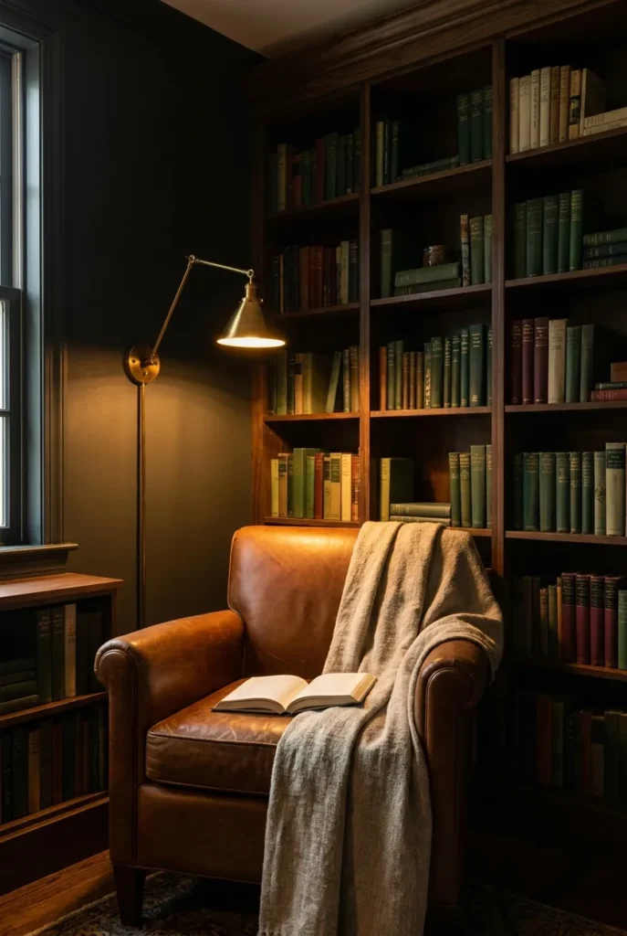
Picture a corner where the walls are dark enough to make the lamp glow like a fireplace. The books aren’t a pile you trip over. They’re arranged by color and weight until the whole shelf breathes. The chair is the kind that swallows you whole for three hours without warning.
That’s a moody home library reading nook. And it doesn’t ask for a dedicated room, a $10,000 built-in, or a landlord who likes you. It asks for five deliberate choices: the right wall color, the right bulb temperature, the right shelving method, the right seat, and the right softness layered on top.
Here’s exactly how to build it, with actual paint codes, Kelvin numbers, and a full renter-safe version that costs under $400.
What “Moody” Actually Means in a Home Library (and the 5 Rules That Separate Intention From Accident)
Most people hear “moody” and think: paint everything dark, pile some books, done. That’s not moody. That’s a dim room.
Moody is a quality of light trapped by color. A charcoal wall bathed in four overhead recessed lights running at full brightness looks like a parking garage. That exact same charcoal wall with a single brass swing-arm lamp on a dimmer looks like a scene from a novel you can’t put down. The color didn’t change. The light source did.
Here are the five rules that separate a real moody home library reading nook from a room that just happens to be dark.
The Moody Library Layer Stack (save this, it’s the build order)
| Layer | What It Does | What Kills It |
|---|---|---|
| Wall color | Creates the cocoon. Dark enough to absorb ambient light. | Warm-undertone grays that read greenish or purple under lamplight |
| Shelf color | Should match or go one shade darker than the wall | Bright white shelves cancel the mood instantly |
| Bulb temperature | 2700K on a dimmer, 400 to 500 lumens max per fixture | Anything above 3000K reads as a dental office at night |
| Seat material | Velvet, leather, or boucle. Texture absorbs light warmly | Microfiber and polyester have a faint sheen that reflects harshly |
| Soft layer | Wool throw, linen pillow, sheepskin | Too many competing patterns fight the books for attention |
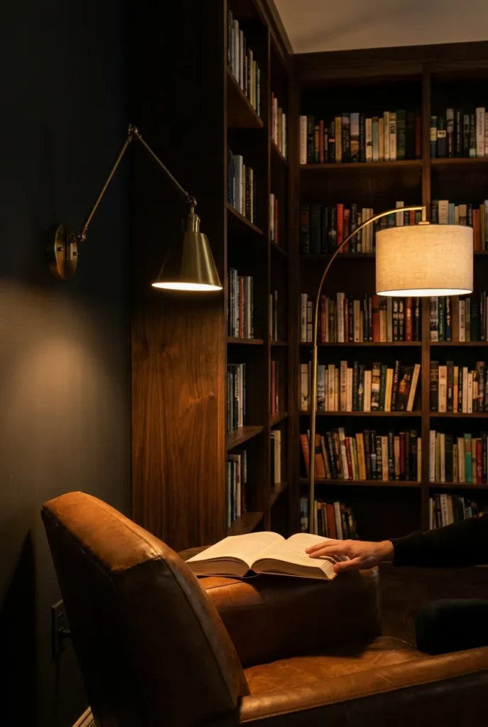
Rule 1: Every light source in the room belongs below eye level. Overhead light is the single fastest way to strip the atmosphere out of any dark wall color.
Rule 2: The wall color and shelf color live in the same family. Charcoal walls with natural pine shelving looks like a catalog photo. Charcoal walls with dark walnut shelving looks like a moody library.
Rule 3: Your books are decor. Front-face some spines, stack some horizontally, add small objects between sections. The shelf is not storage. It’s a composition.
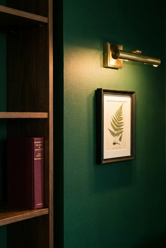
Rule 4: One warm metallic accent (brass, aged bronze, antique gold) ties the room together. Two or more and it becomes a theme.
Rule 5: A rug anchors the reading seat. Without one, the chair floats in the room. The rug is what tells the eye that this corner is a place, not just furniture.
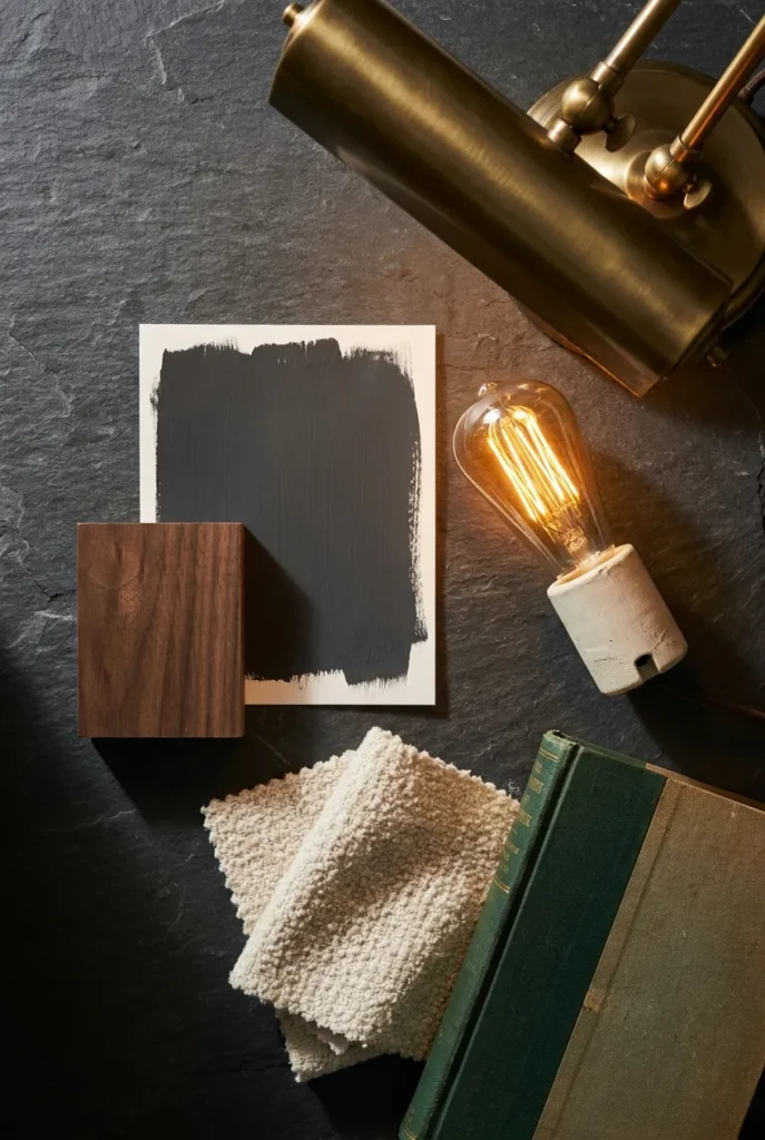
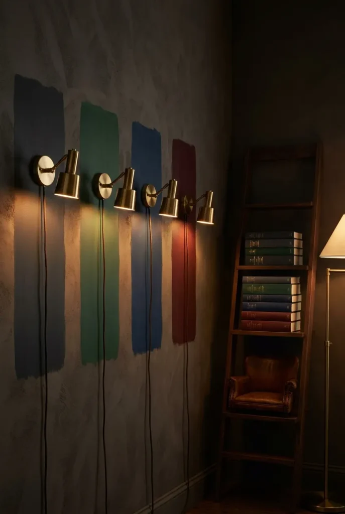
The Moody Home Library Color Palette: Actual Paint Codes, Not Just “Go Dark”
The specific shade matters more than the color family. Emerald green with yellow undertones looks muddy under lamplight. Emerald green with blue undertones looks like a room from a Victorian university library. Same color family, completely different result at 9 pm under a 2700K bulb.
I repainted my own library corner twice before I landed on the right choice. The first attempt was a warm charcoal with red undertones that turned bronze under lamplight and looked nothing like the swatch card in the store. The second time, I tested four samples directly on the actual wall and checked them at night under the lamp I planned to use. Night-test your paint. This is non-negotiable.
The four color families that work for a moody home library, with specific codes:
Charcoal and off-black are the most versatile foundation. Benjamin Moore Wrought Iron CC-640 is the most-pinned charcoal in this category for good reason: it reads true under lamplight without going full black, and it pulls slightly green rather than blue, which keeps the room warm. Sherwin-Williams Tricorn Black SW 6258 goes a full shade darker and suits rooms with at least one strong natural light source during the day.
Forest and hunter green are the dark academia home library default. Farrow and Ball Studio Green No. 93 is deep and slightly sage-leaning, one of the best choices if you want the scholarly library look without going all the way to black. Benjamin Moore Salamander 2050-10 pulls richer and bluer, which reads beautifully under 2700K lamplight and photographs dramatically. Both shift significantly depending on the light in the room.
Deep navy is the approachable entry point. Benjamin Moore Hale Navy HC-154 has been the library designer’s dependable choice for more than a decade. It works with both brass and bronze hardware and reads moody without the full commitment of charcoal.
Burgundy and oxblood work best as a single accent wall behind the shelving rather than all four walls. Sherwin-Williams Roycroft Bordeaux SW 2314 sits right between wine and rust, and it pairs remarkably well with dark walnut shelving and green book spines.
For your shelving color: if you’re painting built-ins, go one shade darker than the wall. If you’re working with IKEA Billy bookcases or a freestanding ladder shelf, dark walnut peel-and-stick contact paper costs $18 and transforms white flat-pack furniture into something that earns its place in the room.
The Benjamin Moore Color Trends page is worth a look before you buy samples: it shows how their deep hues perform in professionally lit rooms across different natural light conditions, which can save you a $40 mistake at the paint counter.
Moody Home Library Lighting: The 2700K Rule and Why a Dimmer Is Non-Negotiable
Lighting is where most moody home library attempts go sideways. Not because people pick the wrong fixture. Because they skip the dimmer and leave the overhead light on.
Here’s what actually happens: you install a beautiful brass swing-arm lamp. You aim it at the chair. The kitchen pendant overhead is still casting flat white light across the room. The atmosphere is gone before the book is open.
The fix is simple and inexpensive. A plug-in dimmer switch (the kind that sits between your lamp cord and the outlet) costs $12 to $20, requires no wiring, and works in any rental. Set your reading lamp to about 60% brightness. Kill anything overhead. That’s it.
The exact bulb specifications for a moody home library:
Color temperature: 2700K only. Anything above 3000K pushes toward daylight and strips the warmth from dark walls. Anything below 2200K reads as amber-candle and strains the eyes for actual sustained reading.
Lumens per fixture: 400 to 500 for the primary reading lamp. More than 600 and you lose the cocoon quality. Less than 350 and you’re squinting by chapter two.
Fixture types, ranked by mood impact for a moody home library reading nook:
- Plug-in brass swing-arm lamp with adhesive wall mount (no drill, one 3M strip, works in any rental)
- Arc floor lamp with a focused shade (keeps cords managed, fully moveable)
- Plug-in wall sconce with a cord-covering canopy (hides the wire against the wall, very clean look)
- Clip-on reading light attached to a shelf edge (supplementary use only, not a primary source)
Fairy lights deserve a note here. Warm Edison fairy lights woven through the bookshelves add glow and texture, and they look exceptional in photos. They top out at around 50 total lumens and will not light a page. Use them as atmosphere, not as your reading solution.
For a complete breakdown of which plug-in sconce backplates hide cords cleanly and which bracket styles actually hold a swing-arm lamp steady on an apartment wall, see our full guide to the best plug-in wall sconces for a reading corner.
According to ENERGY STAR’s LED bulb guidance, certified 2700K LEDs produce 800 lumens on roughly 8 to 10 watts total. Running your reading lamp at 60% on a dimmer means you’re using around 4 to 5 watts at the socket for a full moody reading session. Worth knowing if you’re running three fixtures simultaneously.
Shelving and the Layered Book Method: Making Your TBR Pile Look Like It Was Staged
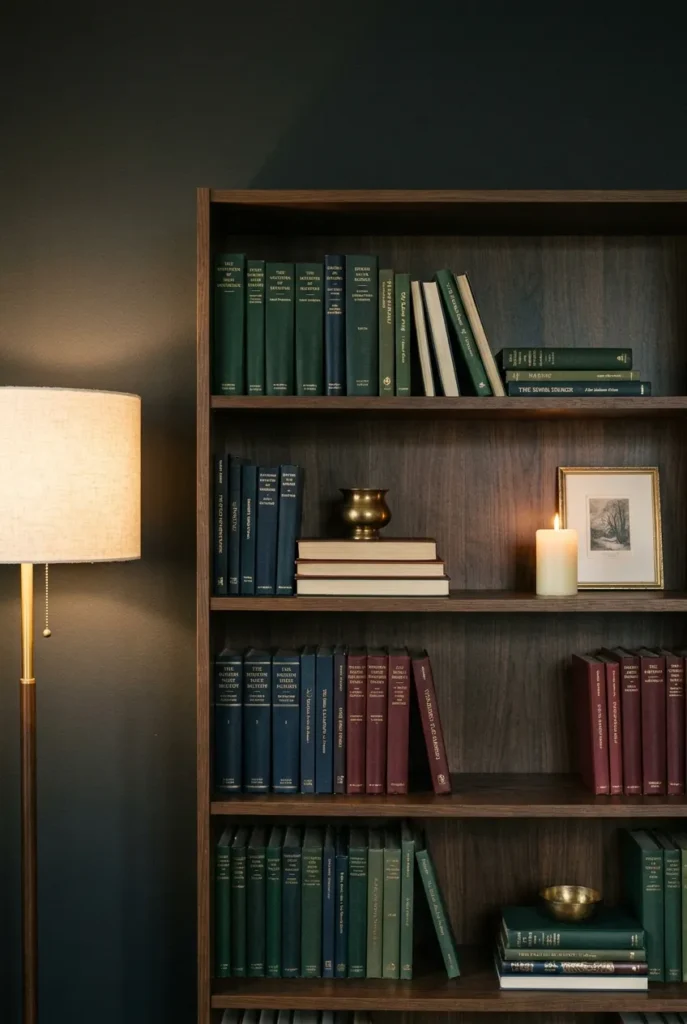
The difference between a room full of books and a moody home library reading nook is arrangement. Books organized purely by spine color (the Instagram method) look styled but cold. Books arranged randomly look like you ran out of shelf space in the kitchen. The layered book method lands in the intentional middle.
Here’s how it works in four steps, in order.
Step 1: Anchor with height. Place the tallest books at the outer edges of each shelf. They create a natural frame and prevent the top line of books from reading as a flat, institutional row.
Step 2: Break the grid. Every third or fourth section, stack three to five books horizontally instead of vertically. Rest something small on top: a brass paperweight, a ceramic vessel, a small framed print, a stub of beeswax candle. This interrupts the rhythm the eye gets bored by.
Step 3: Color cluster without being rigid. Group books loosely by spine color (dark greens and navies together, creams and tans together), but leave intentional breaks: a cream spine next to a charcoal one, a single burgundy outlier in the navy section. Rigid color blocking looks designed. Loose color clustering looks lived in.
Step 4: Leave one deliberately sparse shelf. Three books, a small candle, one framed print. That breathing room gives the eye a rest and prevents the wall from reading as a storage unit.
For the shelving structure itself: two IKEA Billy bookcases flanking a reading chair create the moody library look for around $160 in materials. Dark metal ladder shelves work well if you’re working in a corner under 6 feet wide. The freestanding option here matters: built-in look, no carpenter, no permission needed.
If you’re scaling to a full bookcase wall across 10 or 12 feet of space, our complete guide to reading nook bookcase walls that require no carpentry covers the exact bracket and upright systems that work on standard drywall without major structural anchoring.
The Reading Seat: Which Chair Actually Earns a Moody Home Library
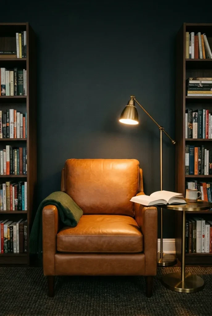
The chair is the functional center of the nook. Everything else is atmosphere. So it has to earn its place twice: once visually, once physically.
Here’s the honest comparison most style guides skip.
| Seat Type | Best Use Case | Seat Height | The Real Downside |
|---|---|---|---|
| Cognac leather armchair | Full moody library look, small footprint | 17 to 19 inches | Gets cold in winter, tacky-warm in summer |
| Jewel-tone velvet accent chair | Maximum drama, outstanding in photos | 17 to 18 inches | Velvet pills under daily use, especially with pets |
| Chaise longue | Long sessions of 2 or more hours, reclined reading | N/A (reclines) | Needs at least 5 feet of floor clearance |
| Upholstered daybed | Double as guest sleeping, marathon reading | N/A | Too large for corners under 8 feet wide |
| Boucle barrel chair | Softer moody aesthetic, cottagecore-adjacent | 17 to 18 inches | Less structured backrest, harder to read upright for long stretches |
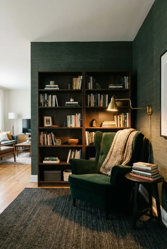
For most readers, the cognac leather armchair or a deep velvet accent chair in forest green or bordeaux is the strongest choice. Both read moody without trying too hard. Both photograph well at any angle. And both hold up to daily sitting, though the velvet chair is a harder sell if you have a cat with opinions about upholstery.
The 18-inch reach rule applies here directly: your side table should sit within 18 inches of the chair arm so the lamp arm clears your shoulder and you can reach a mug without leaning. A round side table at 24 to 26 inches tall is the standard pairing for a chair with a seat height of 17 to 18 inches.
Seat depth matters more than most people realize going into this. Standard armchair seat depth is 20 to 22 inches. Anything under 18 inches and you’re perching, not reading. Anything over 24 inches and you need a lumbar pillow just to reach the back support.
Moody Home Library Curtains, Wallpaper, and the Texture Layer
The wall color sets the room. But the surfaces you don’t immediately notice (the curtain pooling behind the shelf, the grasscloth texture visible between the books, the rug grain under the lamplight) are what make the room feel finished instead of staged.
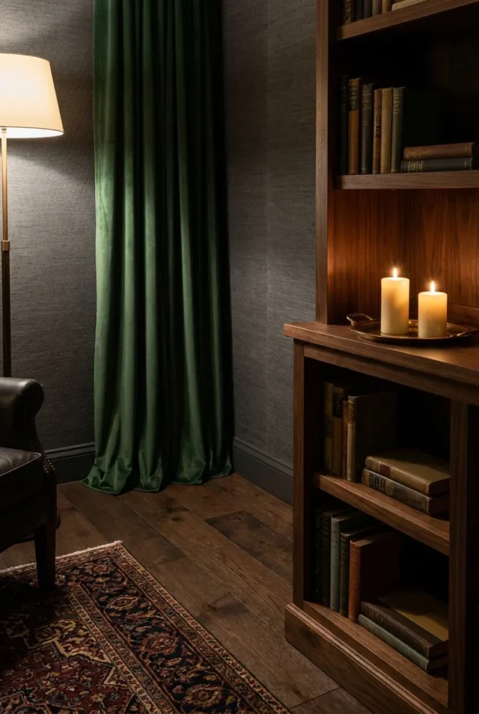
Curtains: Go floor-to-ceiling without exception. For a moody home library reading nook, blackout curtains in forest green, deep burgundy, or charcoal velvet do two things at once. They block the daylight that washes out your atmosphere. And they add a soft column of texture that makes the room read taller and more enclosed. Mount the rod 4 to 6 inches above the window frame and extend it 8 to 10 inches beyond the frame on each side so the curtain stack clears the glass entirely when open. That one detail makes rental curtain panels look custom-installed.
Wallpaper: If you’re renting or not ready to commit to paint, removable dark-toned wallpaper has improved significantly since 2023. Look for patterns that read as texture rather than print: linen weave, grasscloth effect, subtle damask at a small scale. A dark grasscloth peel-and-stick in charcoal or forest green applied to just the wall behind the bookshelves (roughly 8 to 10 linear feet of paper) creates the moody library backdrop for around $45 to $60. Peels clean from smooth drywall at room temperature.
Rugs: A Persian-style rug in burgundy, navy, and cream is the classic anchor for this aesthetic. A solid dark jute rug works if you want the atmosphere without the pattern. Size rule: the front two legs of the chair should sit on the rug. A 5×7 foot rug is the minimum for a single chair and side table. Anything smaller reads like it got lost on the way to the bathroom.
The smell of the room matters and nobody writes about it. Unscented beeswax candles near dark bookshelves. Old paper and warm wax together. That combination of scents is the sensory detail that makes the corner feel like a place rather than a setup. One or two small pillar candles on a brass tray on the shelf edge. Never left unattended, never placed directly next to a book spine.
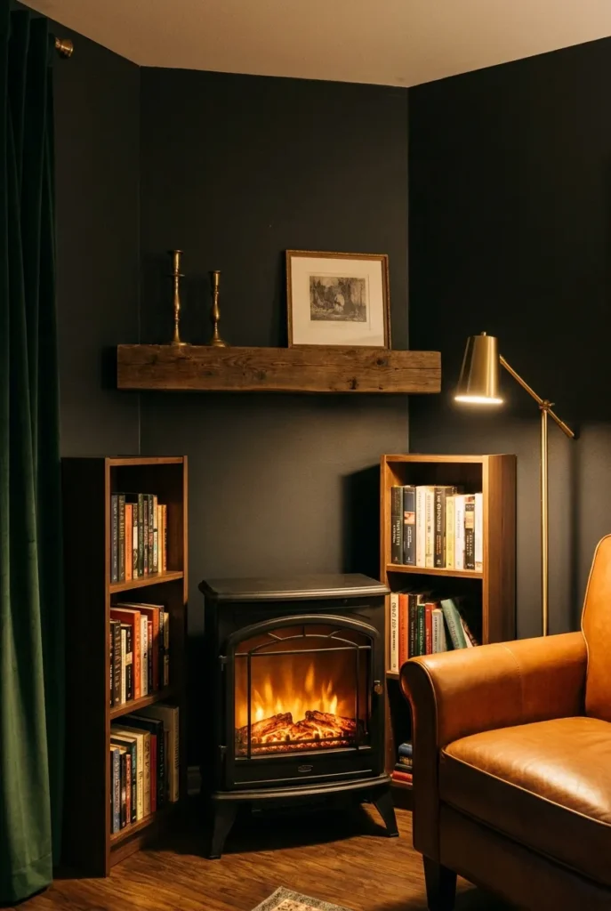
The Moody Home Library Fireplace Corner: Real Heat, Electric, or Faux
A fireplace is the fantasy centerpiece of this room. Most moody home library mood boards show a carved stone or brick fireplace with a leather chair pulled alongside it, and for good reason: the combination of warm flame light and dark shelving hits something deep in the comfort brain that nothing else quite replicates.
Most of us don’t have a fireplace. Here’s how to build the same sensory effect without one.
Electric fireplace inserts in the 23 to 28-inch freestanding range cost $90 to $250 at Home Depot or Amazon and require a standard 120V outlet. Place one on the floor beneath the bookshelf cluster or centered below a mirror to create a faux-mantel effect. The flame on mid-range units (Duraflame, R.W. Flame) reads convincingly in a dark room with no competing light. They also produce actual heat: up to 5,000 BTUs, enough to warm a 400 square foot room without a separate space heater.
Faux fireplace panels made from architectural foam, painted to match your wall color, cost $120 to $300 and install with construction adhesive. Add an electric insert inside and a reclaimed wood mantel shelf mounted above (about $80 to $120 for a raw wood beam at Home Depot), and you have a convincing fireplace library corner for under $450 total.
The candle grid is the $20 version and it works. Three pillar candles on a floor-level brass or iron tray, arranged loosely in a triangle, placed in the corner where a fireplace would logically sit. The warm flicker in a dark room is most of what the fireplace delivers atmospherically anyway.
Honestly, the first time I set up the candle grid in my own corner I sat there for two hours without checking my phone. Not because of the candles specifically. Because every layer in the room was finally pulling in the same direction.
Building a Moody Home Library Reading Nook in a Small Space or Rental
Here’s where every other moody library article fails the actual reader: they assume you have a room for this. A dedicated library room. Twelve feet of wall. A ceiling that allows an iron chandelier. Permission from someone who owns the building.
You probably have a 5×6 foot corner and a lease. That’s enough.
The renter-safe, small-space version of a moody home library reading nook fits into the corner of a living room or bedroom, leaves no marks on the walls, and costs between $335 and $700 total, depending on your thrifting range.
The 5-piece no-drill moody library corner build:
- Two IKEA Billy bookcases at 31.5 inches wide x 79.5 inches tall, placed side by side or flanking the chair. They’re freestanding, no wall anchor required. Combined width: approximately 63 inches. Cost: around $160 for both.
- Peel-and-stick dark grasscloth wallpaper applied to the wall section between and behind the bookcases. Covers roughly 6×7 feet. Cost: $45 to $60. Peels clean from smooth apartment drywall at room temperature without adhesive residue.
- A plug-in brass swing-arm lamp with a single adhesive 3M strip for wall mounting. No drill, no hole, landlord will never know. Cost: $40 to $85 depending on brand.
- A velvet or leather accent chair pulled in front of the bookcases. Thrifted armchairs in good condition run $30 to $120 on Facebook Marketplace or at Goodwill. New velvet accent chairs start at $150 at HomeGoods and TJ Maxx.
- A 4×6 foot dark Persian or jute rug with the chair’s front legs sitting on it. Cost: $60 to $120 at HomeGoods, Amazon, or TJ Maxx.
Total range: $335 to $730. Most readers who thrift the chair land around $400.
One concern renters raise every time: won’t the dark wallpaper be difficult to remove on move-out? Peel-and-stick grasscloth removes cleanly from smooth painted drywall at room temperature, 50 to 70 degrees Fahrenheit. Cold air (below 45 degrees) makes the adhesive brittle and can pull paint. Do not attempt removal in winter without warming the wall first with a hair dryer.
If you’re drawn to this kind of corner setup but want a lighter palette to compare against (walnut, warm brass, and lighter neutrals at the same price range), our mid-century modern reading nook guide uses the same no-drill build logic with a palette that works in smaller or brighter rental spaces.
FAQ
What is the best color to paint a moody home library?
Deep charcoal and forest green are the two most versatile and forgiving starting points. Benjamin Moore Wrought Iron CC-640 reads true under warm lamplight and leans slightly green rather than blue, which keeps the room from feeling cold. Farrow and Ball Studio Green No. 93 is the go-to for a dark academia reading room look. The critical rule with both: test your sample on the actual wall at night under the bulb you plan to use, not in daylight at the paint store.
What is a good size for a home library?
A functional moody home library reading nook fits in a 5×6 foot corner. Two standard IKEA Billy bookcases at 31.5 inches wide and a single accent chair fit comfortably within that footprint. If you want a dedicated library room rather than a nook, most interior designers work with a minimum of 10×12 feet so you can have full-height shelving on two walls and a central reading seat without the room reading as a corridor.
What lighting is best for a moody home library aesthetic?
2700K LED bulbs at 400 to 500 lumens, placed below eye level, on a dimmer. A plug-in brass swing-arm lamp aimed at the reading chair is the single most impactful change you can make. Kill the overhead light entirely. Fairy lights in the shelves add texture but top out around 50 lumens total and cannot replace a directional reading source.
What is the second most beautiful library in the world?
The Real Gabinete Portugues de Leitura in Rio de Janeiro frequently appears in second place on these lists, behind the Biblioteca Joanina in Coimbra, Portugal. Both feature floor-to-ceiling dark wood shelving, gallery-height ceilings, and warm lamplight. They are, essentially, the professional version of what we’re building in this corner.
Can I build a moody home library in a small apartment with no drilling?
Yes. Two IKEA Billy bookcases (freestanding, no wall anchor), peel-and-stick dark grasscloth wallpaper on the wall behind them, a plug-in brass swing-arm lamp on an adhesive mount, a velvet or leather accent chair sourced second-hand, and a 4×6 jute rug. Total cost: $335 to $700. No drilling. No paint. No landlord conversation required.
What makes a home library feel dark academia versus just “dark”?
Dark academia layers the literary and the slightly scholarly: aged wood, dark green or charcoal walls, stacked hardcovers with cloth or leather spines, brass accents, candlelight, and a Persian or antique-style rug. It leans antique and deliberate. A room that is just dark has the color without the composition. The books, the texture, and the warm brass are what separate dark academia from a room someone forgot to paint back to white.
What books should every moody home library have?
For the aesthetic specifically: hardcovers with textured cloth or leather spines style and photograph better than mass-market paperbacks. Spine color matters more than title for visual arrangement. The honest answer is to build your TBR pile first and style around what you actually own. A shelf of books you’ve read will always look more real than a shelf bought for decoration.
Conclusion
A moody home library reading nook doesn’t require a dedicated room, a renovation budget, or walls you’re allowed to paint. It requires deliberate choices in the right order: a wall color that holds the lamplight, a bulb temperature that lets the room breathe, shelves arranged like they belong there, and a chair that means it.
Pick your color. Night-test it under your actual lamp before you commit. Then work outward: shelving method, seat, soft layer, curtains. Each layer earns the next one.
If you’re building this in the corner of a rented apartment at 11 pm with two Billy bookcases and a velvet chair from Facebook Marketplace, that counts. That is the real version of this. Come back and show us how it turned out.