
Pastel Kitchen Ideas That Read Cottage, Not Candy Shop

Most pastel kitchen ideas fail in exactly the same spot. You pick a soft mint, you paint the lower cabinets, and by week two the room reads nursery instead of cottage. The color was never the problem. What was missing is a third shade, one that is dirtier and darker than both the pastel and the white, and without it every soft color on earth goes sugary. That fix takes one afternoon and it works whether you own the place or your lease says no paint. Here is the rule first, then eight verified colors, then the version you can do with zero landlord conversations.
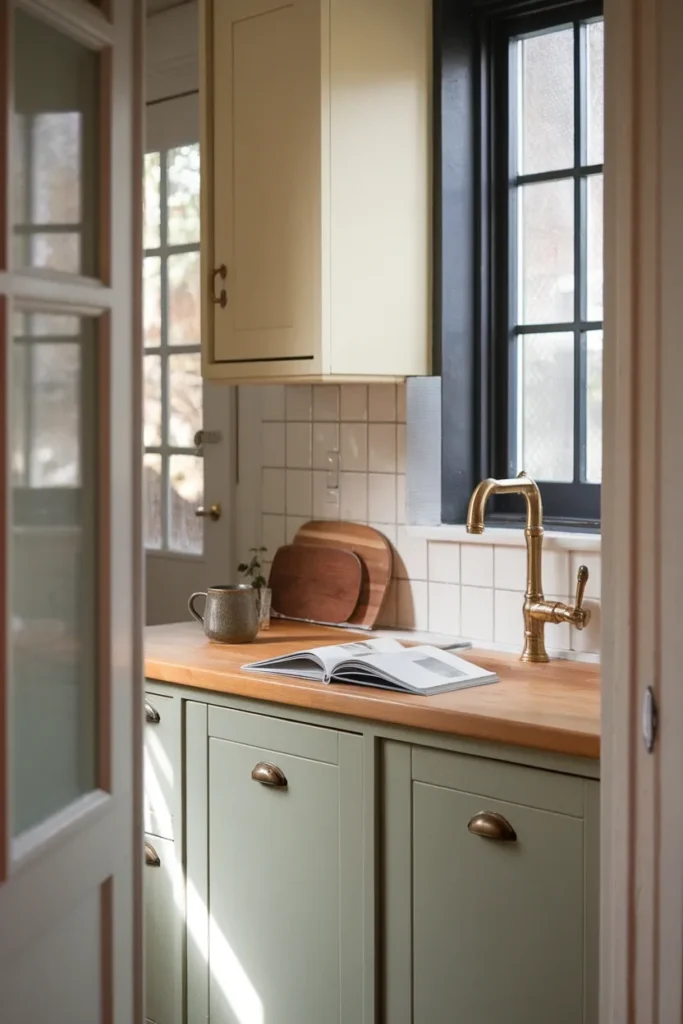
Start Here: The Muddy Third Rule
Every pastel kitchen needs three colors, and the third one has to be muddy.
Pastel plus white equals nursery. Every time. The two shades are both high in value and low in saturation, so the eye reads them as one soft blur with nothing to push against. Add a third color that is genuinely darker and slightly dirty, and the pastel instantly reads as a deliberate design choice instead of a color you were scared to commit to.
Muddy means desaturated and grounded. Think aged brass, walnut, dark olive, oxblood, unpolished soapstone, charcoal, black cast iron. Not navy, not primary anything.
Here is the ratio that works: roughly 60 percent neutral base (your walls, your uppers, your countertop), 30 percent pastel (usually the lower cabinets or the island), and 10 percent muddy third (hardware, one shelf, the window frame, the pendant, the stool legs).
Three fast versions:
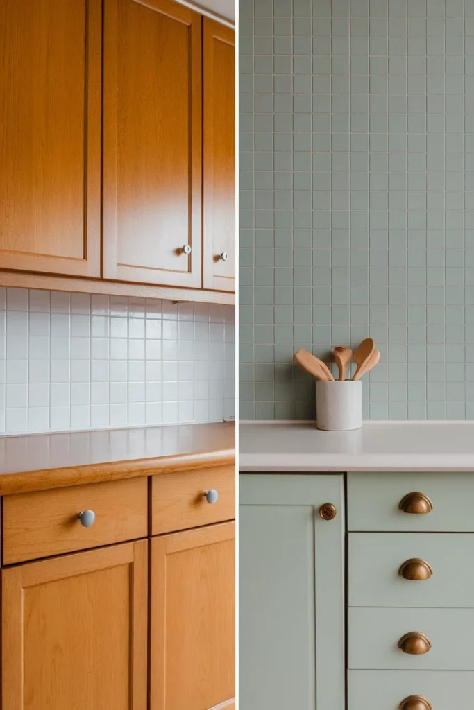
- Sage green lowers + cream uppers + aged brass hardware. The most forgiving combination on this list, and the one to start with if you are nervous.
- Dusty pink lowers + warm white uppers + walnut open shelf. The wood is doing the muddy job here, so you can keep the hardware simple.
- Butter yellow lowers + soft white uppers + matte black hardware. Highest contrast of the three, best in a kitchen with real daylight.
Notice that the pastel is on the bottom in all three. Dark or saturated colors below eye level and lighter colors above is how rooms read as grounded rather than top-heavy, and it is why nearly every cottage kitchen that works follows the same split.
If you only take one thing from this page, take the third color. It is the entire difference between the pastel kitchens you save and the pastel kitchen you regret.
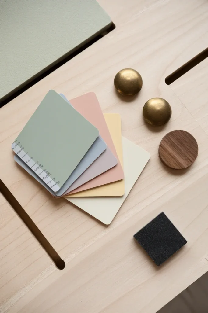
The Eight Pastels That Hold Up in a Real Kitchen
Kitchens are lit badly and they get dirty. That rules out about half the pastel fan deck immediately. These eight survive both.
| Color | Code | Family | What it does | Pair it with |
|---|---|---|---|---|
| Setting Plaster | Farrow & Ball No. 231 | Dusty pink | Reads pink but carries yellow pigment, so it stays warm instead of turning cold | Walnut, unlacquered brass, cream |
| Teresa’s Green | Farrow & Ball No. 236 | Soft blue-green | Sits between mint and sage, quiet in low light | Warm white, oak, black iron |
| Palladian Blue | Benjamin Moore HC-144 | Blue-green | The safest pastel blue in a kitchen, never goes baby | Cream, brass, honey wood |
| Sea Salt | Sherwin-Williams SW 6204 | Green-gray | Barely a color in bright rooms, more green in dim ones | White Dove trim, natural jute |
| Butter Up | Sherwin-Williams SW 6681 | Butter yellow | Creamy rather than acid, the 2026 favorite | Matte black, soft white, terracotta |
| Hawthorne Yellow | Benjamin Moore HC-4 | Warm yellow | Deeper and more historic than Butter Up | Dark green, aged brass |
| Topsail | Sherwin-Williams SW 6217 | Pale blue | Airy, best in a room with real daylight | Charcoal, warm oak |
| White Mint | Sherwin-Williams SW 6441 | Mint | The one true mint that does not go dental office | Cream, walnut, unlacquered brass |
For trim and uppers, Benjamin Moore White Dove OC-17 is the default in cottage kitchens for a reason: it has enough warmth to sit beside a pastel without making it look gray.
One useful note on Setting Plaster before you write it off as pink. Farrow and Ball’s own description calls it “a dusty plaster pink named after the blushing walls we often admire in newly plastered houses,” and the yellow pigment in it is exactly why it behaves in a kitchen when other pinks do not. You can see the official finishes and order a sample pot for $9 on Farrow and Ball’s Setting Plaster color page (price checked August 11, 2026).
Buy samples. All of them, if you are torn. Nine dollars against a $400 mistake is not a close call.
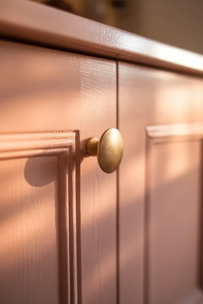
Muted, Not Minty: Where Pastel Actually Went for 2026
The pastel coming back is not the 2016 pastel. That version was clean, bright, and saturated, and it looked like an ice cream shop. The current one is dustier, grayer, and closer to a color that has faded in sunlight for forty years.
Pinterest’s trend desk landed in the same place. In Pinterest’s 2026 color palette report, published January 14, 2026, one of the five named colors is Jade, described officially as “somewhere between mint and moss.” Mint pulled toward moss is precisely the muddy-pastel direction, and it is coming from first-party search data rather than a designer’s guess.
The trade press agrees. Writing for House Digest on December 7, 2025, Ben Kempton of 202 Design put it this way: “Pastels are returning in a far more tailored and architectural manner than their playful reputation suggests.” That piece names pistachio green, robin’s egg blue, and dusty pink as the shades leading the shift.
The practical translation is simple. If a pastel looks like it came out of a plastic egg, skip it. If it looks like it has been sitting in a farmhouse window since 1974, buy the sample.
Butter yellow deserves its own line here. It has been building since early 2025 and it is genuinely the color of the moment in kitchens, but it is also the one most likely to skew acidic under bad light. Test it before you commit.
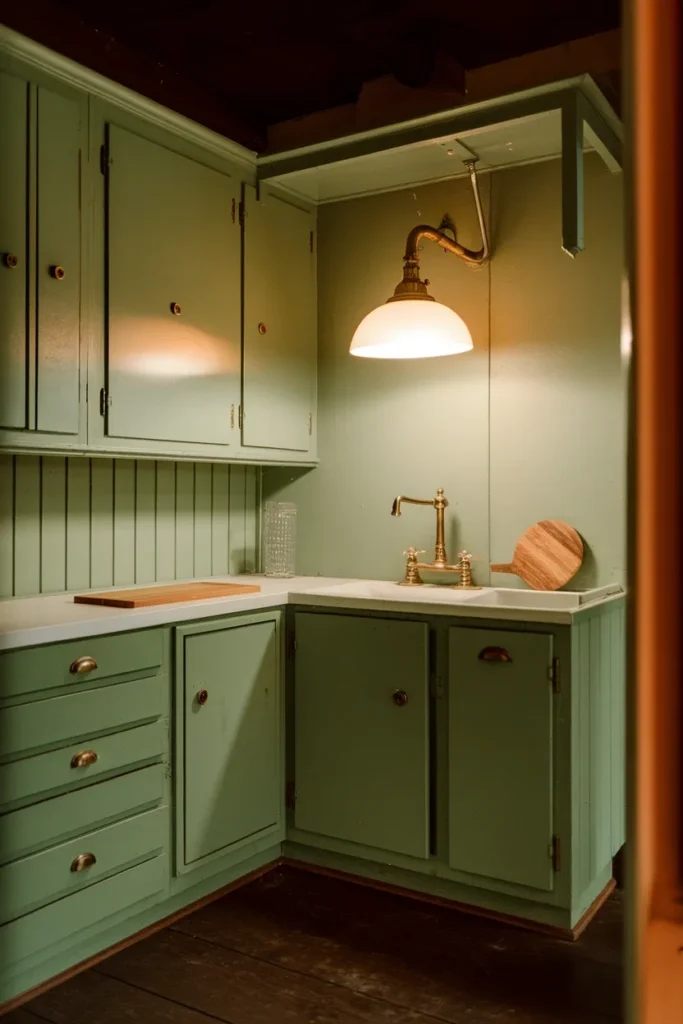
The 3 PM Test: Why Mint Goes Hospital Green After Dark
This is the step almost nobody takes, and it is the reason so many pastel kitchens get repainted within a year.
Pastels are low-saturation colors, which means they have very little pigment fighting for your eye’s attention. Whatever light you throw at them wins. A mint that looks soft and sun-warmed at 3 PM can turn flat and clinical at 9 PM under a cool ceiling fixture, and the paint has not changed at all.
The 3 PM Test: paint a sample board, at least 12 by 12 inches, and look at it three times before you buy a gallon. Once at 3 PM in daylight. Once at 9 PM under the bulbs you actually own. Once against your existing countertop, not against a white wall.
Three things that swing the result:
Bulb temperature. Most kitchens ship with 3000K to 4000K bulbs because they read as “clean.” Those same bulbs strip the warmth out of every pastel in this article. Swap to 2700K and the entire room warms up. This one change costs less than $20 and does more for a pastel kitchen than any other single purchase.
Window direction. North-facing windows deliver cooler, bluer light all day, which pushes green pastels toward gray and pink pastels toward mauve. South-facing rooms run warm and are far more forgiving. If your kitchen faces north, lean toward the warmer end of the pastel range and skip the cool blues.
The countertop underneath. A cool gray quartz will make a warm pastel look muddy in the bad way. Warm butcher block will make a cool pastel look green. Hold the sample against the actual surface.
Do the test. It costs $9 and one evening, and it is the only reliable way to know what you are buying.
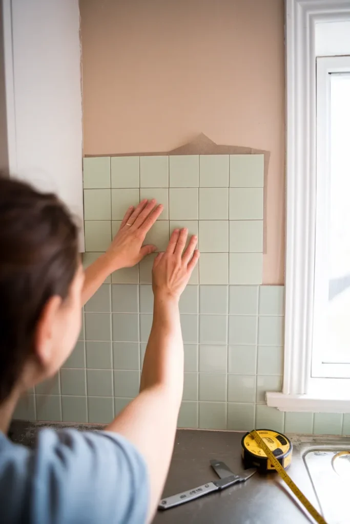
No Paint, No Permission: The Renter’s Pastel Kitchen
If your lease forbids paint, drilling, or both, you can still get most of the way there. Every method below is reversible.
Peel-and-stick backsplash. The single highest-impact renter move. Smart Tiles vinyl peel-and-stick runs about $24.98 for a 2.8 square foot four-pack at Home Depot, which works out to roughly $8.92 per square foot (checked August 11, 2026). It is not cheap per foot, but a standard backsplash run is small. Warm the adhesive with a hair dryer before you peel it off at move-out and it comes away clean.
Removable cabinet film. Matte vinyl wrap in a soft sage or pale blue over flat-front cabinet doors. It reads convincingly from four feet away, which is every distance a kitchen is ever seen from. It fails on heavily detailed shaker doors, so check your door profile first.
Swap the hardware, keep the originals. Unscrew the builder-grade knobs, put them in a labeled bag in a drawer, install aged brass or matte black. This is your muddy third and it takes twenty minutes. Screw the old ones back on the day you leave.
Cafe curtains on a tension rod. No drilling at all. Covered properly in the next section.
Bring the pastel in objects instead of surfaces. Enamelware in soft mint, a butter yellow stand mixer, stoneware in dusty pink, a jute runner. Object-level color is the whole strategy in a rental, and it moves with you.
The one thing not to skip: change the bulbs. A 2700K bulb is renter-safe, costs almost nothing, and does more for the room than the backsplash will.
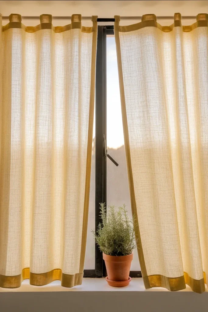
Cafe Curtains and the Soft Layer That Does the Cottage Part
Hard surfaces give you the pastel. Textiles give you the cottage.
A pastel kitchen with nothing soft in it reads showroom. You need fabric somewhere, and in a kitchen your options are narrower than in any other room, which is exactly why cafe curtains keep showing up in every cottage kitchen you have ever saved.
Why cafe curtains specifically. They cover the bottom half of the window, so you keep the daylight and lose the view of the neighbor’s siding. They hang on a tension rod, so renters can install them in ninety seconds. And they put color at counter height, where the eye already is.
Go with unlined linen or cotton in a shade one step softer than your cabinets. If your lowers are sage, the curtains should be cream or the palest butter, not more sage. Matching exactly flattens the room.
The rest of the soft layer:
- A washable runner in front of the sink. Jute reads cottage but sheds and stains. A low-pile washable runner is the practical answer, and the color should come from your muddy third, not your pastel.
- Linen dish towels hung on the oven bar. Cheap, and they change the whole feel of a galley.
- A seat cushion on any stool or bench, in a small-scale check or ticking stripe.
Texture is doing quiet work here that a photo will not show you. Linen makes a room sound different. It absorbs the flat clatter that bounces around a small kitchen full of tile and cabinet fronts, and a kitchen with two fabric surfaces in it feels calmer to stand in than the same kitchen with none, even before you look up.
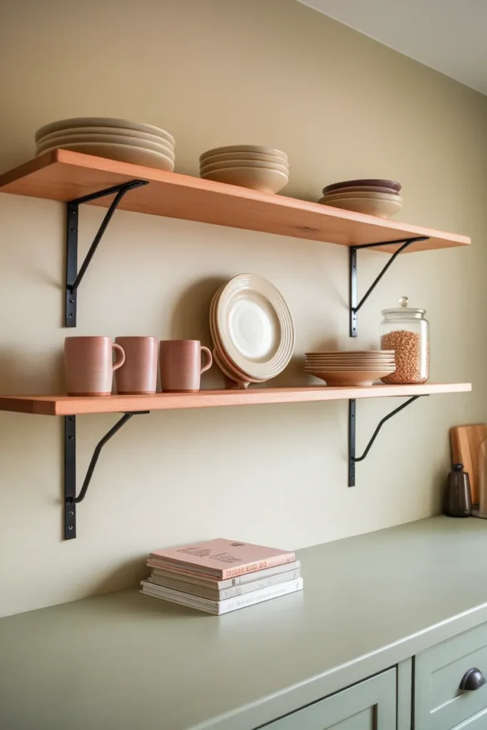
Open Shelving, and Keeping It From Reading Cluttered
Open shelving and pastel are a natural pair, because a pastel wall behind the shelves gives your dishes a background to sit against instead of disappearing into white.
Two things make it work.
Limit the palette on the shelf. Cream ironstone, clear glass, and one accent color pulled from your cabinets. Three color families maximum. The moment a fourth shows up, the shelf reads as storage rather than styling.
Leave one gap per shelf. A shelf filled end to end looks like a cupboard with the door taken off. A shelf that is roughly three-quarters full looks intentional.
The honest trade-off nobody mentions: open shelves collect grease. If the shelf is within about four feet of your cooktop, everything on it develops a film that needs washing every few weeks, not every few months. Put the shelves on the far wall if you have the choice, and keep daily-use dishes up there so they cycle through the dishwasher on their own.
We went deep on the spacing numbers, the dust patterns, and the no-drill install in our cottage kitchen open shelving guide, including the 60/30/10 shelf rule and what the height between shelves should actually be.
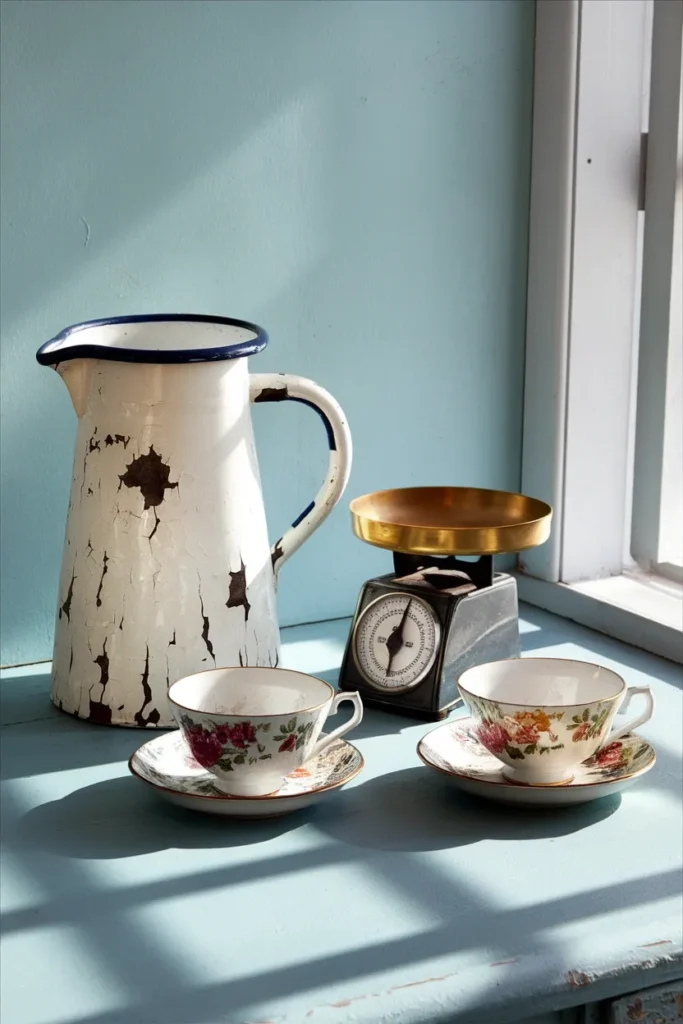
The Vintage Layer That Keeps Pastel From Looking Brand New
A pastel kitchen where every object was bought this year looks like a set. Cottage style depends on the room appearing to have accumulated, and the fastest way to fake forty years of accumulation is to actually own two or three things that are forty years old.
What to hunt for: chipped enamelware, ironstone plates, a wooden cutting board with real knife scars, a brass scale, mismatched floral teacups, a pale green Pyrex bowl. All of it turns up in US thrift stores for a few dollars, and the wear is the whole point.
The rule that keeps it from tipping into clutter: three vintage objects visible at once, maximum. Past three it stops reading as collected and starts reading as a booth.
One safety note worth taking seriously. Vintage ceramics, especially brightly glazed pieces made before the 1970s, can leach lead, and decorative pieces are not held to food-safe standards. Display the pretty ones. Do not serve dinner on them. This is a health question rather than a style question, so if you are unsure about a specific piece, use a US-sold lead test swab or check with your local health department rather than guessing.
For a full walkthrough of sourcing vintage pieces in a kitchen you do not own, including the lead-paint cutoff year on painted furniture, see our vintage kitchen decor guide for renters.
What a Pastel Kitchen Actually Costs
Nobody on page one will tell you this, so here are real 2025 to 2026 numbers with their sources.
Painting cabinets yourself: $200 to $600 in paint and supplies, according to HomeGuide’s cost data (updated February 21, 2025). Cabinet paint runs $20 to $70 per gallon and primer $35 to $50 per gallon. Budget 30 to 60 hours of your own labor for roughly 200 square feet of cabinet, because the prep is most of the job. A sprayer rental adds $40 to $100 per day and cuts the finishing time substantially.
Hiring it out: $70 to $125 per door or $30 to $70 per linear foot, with full projects landing between $2,000 and $6,500 (HomeGuide, same source).
Backsplash, installed: most projects run $15 to $40 per square foot, with labor accounting for $5 to $20 of that, per Angi’s cost guide (updated May 30, 2026).
Peel-and-stick backsplash: roughly $8.92 per square foot based on current Home Depot pricing for Smart Tiles vinyl (checked August 11, 2026). Higher per foot than you might expect, but there is no labor line and no deposit risk.
Paint samples: $9 per pot at Farrow and Ball (checked August 11, 2026). Big-box brands run lower.
The honest math. A renter doing bulbs, hardware, cafe curtains, and a small peel-and-stick run lands in the low hundreds. An owner repainting lower cabinets themselves lands at $200 to $600 plus a long weekend. The pastel is not what costs money. Labor is.
The Kitchen Reading Corner Nobody Plans For
Here is the thing about a soft cottage kitchen: it makes people want to stay in it.
If you have any dead corner at all, the end of a run of cabinets, an awkward three feet beside the fridge, the space under a window that is too small for a table, that corner can hold a chair. Not a dining chair. Something with a back you can lean into.
You need surprisingly little: a small armchair or a painted bench with a cushion, a surface within arm’s reach for a mug, and a light that is not the ceiling. A plug-in wall sconce or a small clip-on reading light at 2700K does it, and neither requires an electrician.
Keep it to about 30 inches of wall and it will not interfere with the kitchen working. Two useful guardrails: the National Kitchen and Bath Association’s planning guidelines call for a minimum 42-inch work aisle for one cook, so measure before you place anything, and put the chair where nobody has to walk past it to reach the sink.
This is where the pastel palette pays off. The corner reads as part of the kitchen instead of furniture that wandered in, because it is wearing the same three colors. If you want to carry that palette into the rest of the house, our whole-house cottagecore decor guide covers how the same rules apply room to room.
Morning coffee, afternoon light, whatever is on top of your TBR pile. It is the most-used seat in the house within about a week.
Five Ways Pastel Kitchens Go Wrong
One: no muddy third. Covered at the top, and it is still the number one failure. Pastel plus white equals nursery.
Two: too many pastels at once. Two soft colors in a room is a palette. Four is a birthday party. Pick one pastel and let the rest of the room be neutral and wood.
Three: cool bulbs. A 4000K bulb will drain every color in this article. It is a $20 fix that most people never make.
Four: pastel on the uppers instead of the lowers. Light color low and dark color high makes a room feel like it is tipping over. Keep the pastel below eye level unless the whole kitchen is one color.
Five: brand-new everything. No patina, no wear, no thrifted object. The room ends up looking staged instead of lived in, and no amount of correct paint fixes that.
Pastel Kitchen Ideas: FAQ
Are pastel kitchens still in style? Yes, though the version in style now is muted rather than bright. Pinterest named Jade, described as sitting “somewhere between mint and moss,” in its 2026 color palette published January 2026, and trade coverage through late 2025 and 2026 has pointed consistently toward dustier, grayer pastels. The clean candy-colored pastel of the mid-2010s is the dated one.
What pastel colors are good for kitchens? Muted greens and warm pinks are the most forgiving. Farrow and Ball Teresa’s Green No. 236, Sherwin-Williams Sea Salt SW 6204, and Farrow and Ball Setting Plaster No. 231 all hold up under kitchen lighting. Butter yellow, like Sherwin-Williams Butter Up SW 6681, is the current favorite but needs good daylight. Avoid anything bright or highly saturated.
What colors go with pastels in a kitchen? A warm white or cream for the bulk of the room, natural wood for warmth, and one dark grounding color for contrast. Aged brass, walnut, matte black, and dark olive all work. The dark color is not optional, which is the entire point of the Muddy Third Rule.
How do I create a pastel kitchen without painting? Change the bulbs to 2700K, swap the cabinet hardware, hang cafe curtains on a tension rod, add a peel-and-stick backsplash, and bring the color in through enamelware and textiles. All five are reversible and none require a landlord conversation.
Do pastel kitchen cabinets show dirt more than white? Less, in practice. Mid-tone pastels hide fingerprints and splatter better than a bright white, which shows every mark near the range. The tradeoff is that touch-ups need a matched sample, so keep the leftover paint labeled.
What is the difference between a pastel kitchen and a cottagecore kitchen? Pastel describes the color. Cottagecore describes the whole vocabulary: worn surfaces, visible textiles, vintage objects, open shelving, and things that look accumulated rather than purchased. A pastel kitchen with all-new glossy fittings is not cottagecore. Add the linen and the thrifted pitcher and it is.
Where to Start This Weekend
Buy three sample pots and do the 3 PM Test. That is the whole assignment.
Not the cabinets, not the backsplash, not the hardware. Paint three boards, look at them in daylight and again at night under your own bulbs, and hold them against your actual countertop. You will eliminate two of the three within about ten minutes, and you will have saved yourself the repaint that most people doing pastel kitchens end up doing in year two.
Then change the bulbs to 2700K while you wait for the samples to dry. It is the cheapest thing on this page and you will notice it the same evening.
If your kitchen has an awkward corner you have never known what to do with, that is where the chair goes.
Keep reading
More cozy nook ideas
 Living Room
Read →
Living Room
Read →
Cabin Living Room Checklist: Everything to Decide Before You Start
No log walls, no stone hearth, no lake outside the window. You can still build a cabin living room in a regular…
 Bedroom
Read →
Bedroom
Read →
English Cottage Bedroom Checklist: Everything to Decide Before You Start
You saved forty pins of floral quilts and sloped ceilings, then looked up at your own bedroom: beige walls, one window, a…
 Nursery & Teen Rooms
Read →
Nursery & Teen Rooms
Read →
25 Teen Boy Bedroom Ideas That Feel Grown-Up, Not Childish
If his room still has the race car lamp and the glow-in-the-dark stars, and the door has started staying shut, he’s telling…