
Cottagecore Kitchen Decor: Floral, Pastel, and Vintage Ideas for Real Kitchens

Cottagecore kitchen decor works in three layers, and you can stack them in any order your budget allows: a pastel base, a floral middle, and a vintage top. Stack all three and a plain rental kitchen starts reading like the pantry of a storybook cottage, even if the actual view is a parking lot. No renovation, no landlord approval, no matching dish set required. Below you’ll find the full formula, honest price bands, the one bulb swap that changes the mood more than paint does, and the failure modes nobody warns you about.
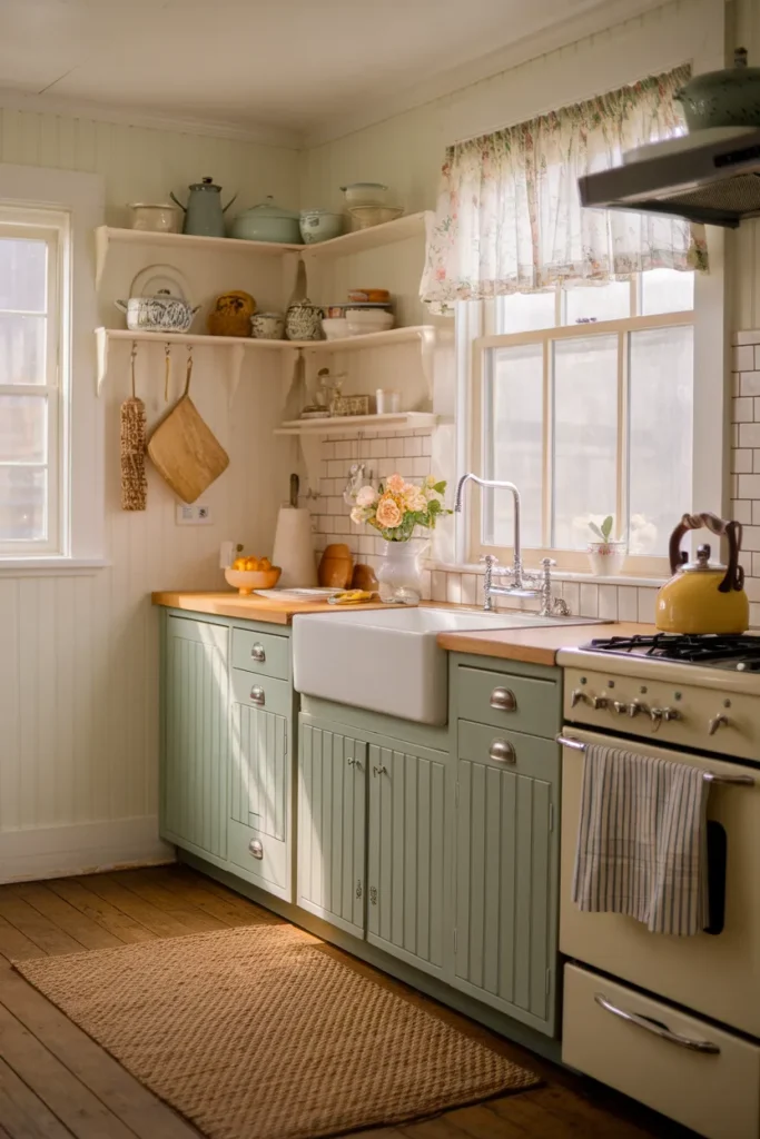
The Three-Layer Rule: Pastel Base, Floral Middle, Vintage Top
Here’s the whole formula. Screenshot it and go:
- Pastel base (biggest change per dollar): walls, cabinet fronts, or large textiles in sage, cream, butter, or dusty rose. One quiet color field calms everything sitting on it.
- Floral middle: curtains, linens, wallpaper accents, and actual stems. Florals are the pattern language of the look.
- Vintage top: the thrifted, dented, hand-me-down pieces that supply the story. New things decorate; old things convince.
Work top down if you’re broke this month (a $6 thrifted pitcher counts), bottom up if you’re repainting anyway. Every idea below slots into one of the three layers, so you always know what you’re shopping for.
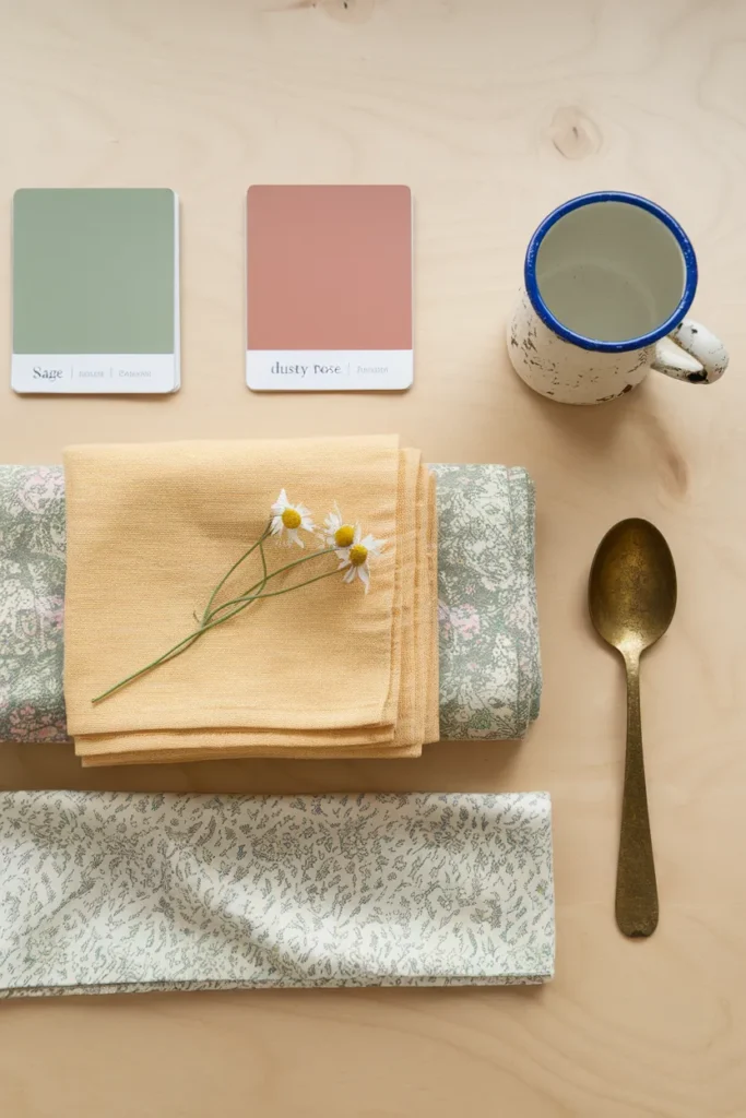
Start With a Pastel Base: Sage, Cream, Butter, Dusty Rose
Pastels do the quiet work in a cottagecore kitchen aesthetic. Sage reads like herbs on a windowsill, cream keeps small kitchens bright, butter yellow warms a north-facing room, and dusty rose earns its keep in small doses: a towel, a bowl, a chair seat.
If you can paint, start with sample pots before you commit. A quart covers roughly 100 square feet, which handles an accent wall or a run of lower cabinet fronts in most galley kitchens. Test your sage at night under your actual bulbs, because plenty of sages go gray after dark.
If you can’t paint, carry the color in objects: canisters, a ceramic utensil crock, tea towels folded over the oven handle, a washable 2 by 3 foot rug at the sink. Renters get the same base layer with zero deposit risk.
One-line failure mode: all pastel and no anchor reads nursery, not cottage, so keep wood tones, a black hardware note, or one aged metal piece in every sightline.
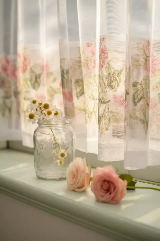
Layer Florals the Cottagecore Way: Curtains, Linens, Real Stems
Florals go on fabric first. A cafe curtain covers only the lower half of the window, mounts on a cheap tension rod just above the sash (no drilling), and gives privacy at the sink while the top half keeps pouring in light. Ready-made pairs typically run somewhere between $10 and $25.
Then linens: one floral tea towel in rotation, a runner on the table, maybe a seat cushion. Then the real thing, because nothing fabric can compete with three stems of whatever’s blooming stuck in a jam jar on the sill. Grocery store carnations count. So do weeds with good posture.
Scale is the trap. Pick one large open print and one small ditsy print, then stop; three competing floral scales in one room stop reading romantic and start reading rummage sale. Which print wins if they’re side by side? The bigger one, always, so give it the window.
The same floral layering logic builds the rest of the house too. If there’s a corner near the kitchen begging for a chair and a lamp, these floral cottagecore reading corner ideas turn it into the spot where you drink the tea you just made.
One-line failure mode: sheer florals over a stove-adjacent window collect grease film fast, so put pattern near the sink and keep the stove window bare or blinded.
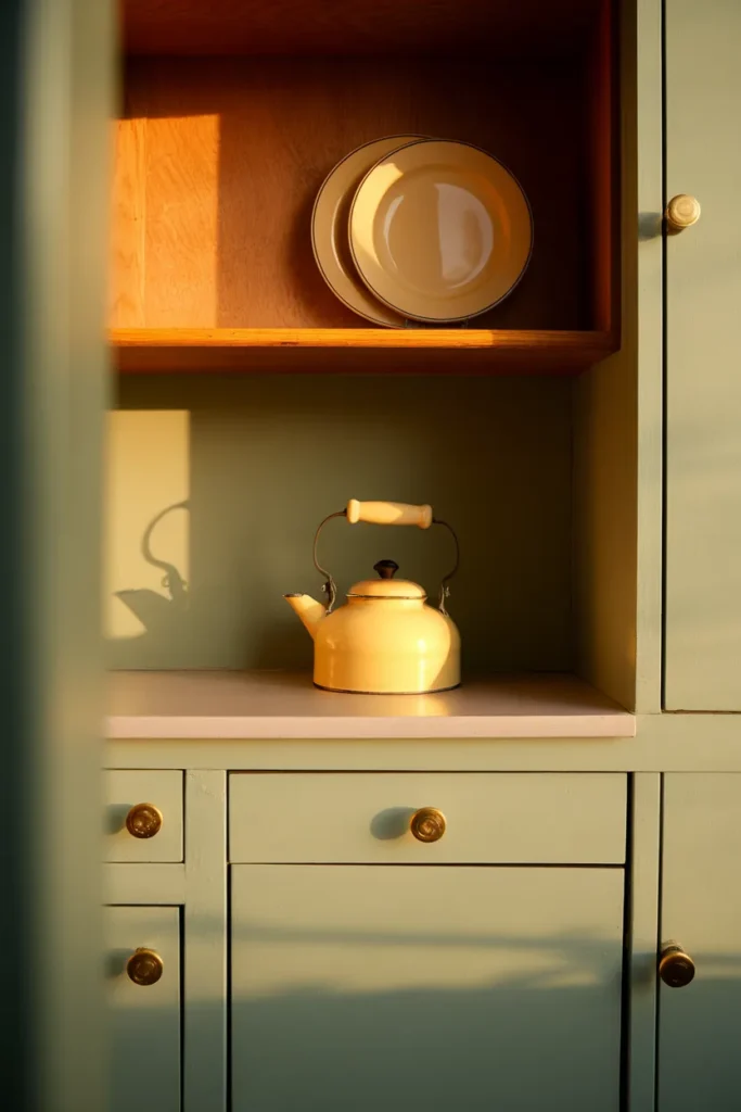
Hunt Vintage Like You Mean It: Thrift, Estate, and Saved Searches
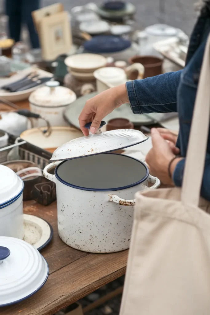
Vintage is the layer that convinces. The reliable US hunting grounds, cheapest first: church and yard sales, Goodwill and Salvation Army, estate sales (go the last day for half off), antique malls, then eBay and Etsy with saved searches for terms like “enamelware,” “ironstone pitcher,” and “vintage bread box.”
Expect around a dollar or two per plate at most thrift stores, and roughly $15 to $40 for a decent enamel pot, bread box, or kitchen scale depending on condition and region. A whole convincing vintage top layer often lands under $60, which is less than one new “farmhouse style” sign at a big-box store.
Buy with your ears and hands, not just your eyes: an enamel lid should rattle a little, ironstone should feel heavier than it looks, and wood handles should be smooth where a hundred hands wore them. That wear pattern is the thing reproductions can’t fake.
One-line failure mode (and the honest trade-off): chipped enamel rusts at the chip and crazed glaze can harbor bacteria, so anything damaged becomes display-only, and you should plan for that before you fill it with soup.
Style Open Shelves So They Read Collected, Not Cluttered
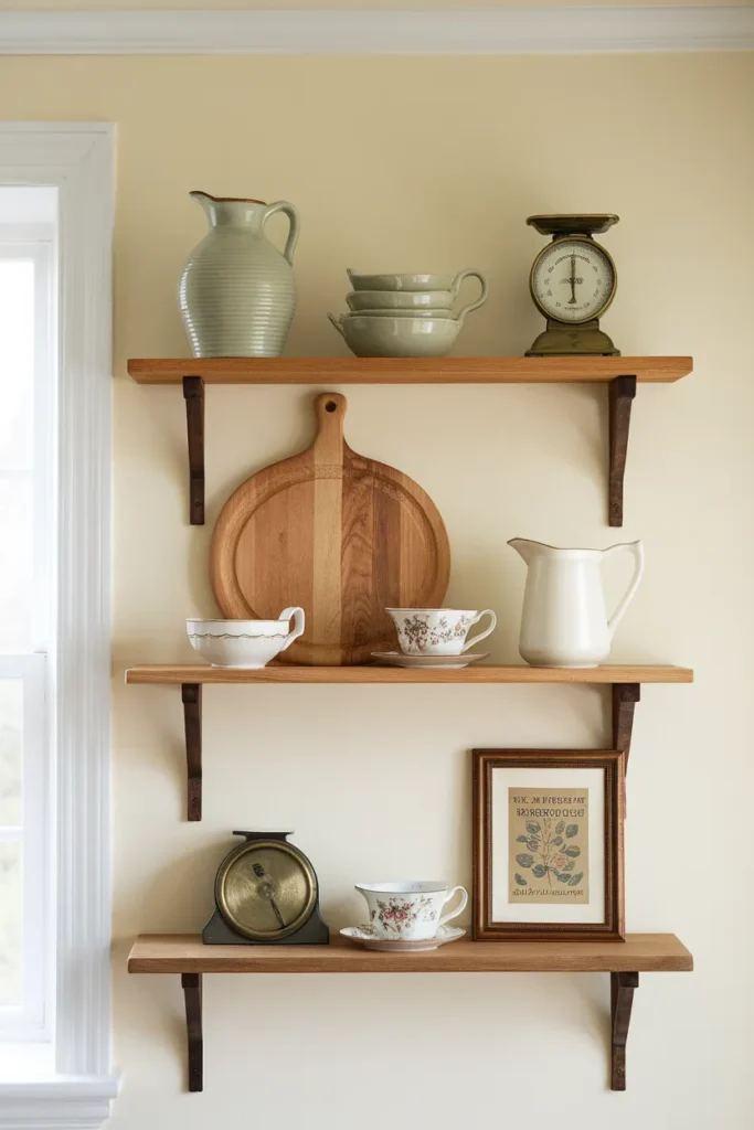
Open shelving is where all three layers meet, and it’s where most kitchens tip into visual noise. My house rule is the one-in-three rule: for every three pieces on a shelf, one is cream or white, one carries color or pattern, and one is wood or metal. Repeat the ratio down the shelf and the mix looks inherited instead of shopped.
Mind the numbers too. Standard open shelves run 10 to 12 inches deep and dinner plates measure about 10.5 inches across, so plates fit, barely; lean them upright against the wall on a plate rail or small stands and they become the art. Leave 2 to 3 inches of air around each grouping. A framed vintage seed packet or old flour ad tucked between groupings does more than another mug.
Put your daily dishes on the most reachable shelf. Pieces you use wash themselves through use, which matters because the honest downside of open shelving is that anything static near the stove wears a fine grease film within a month.
One-line failure mode: styling shelves only with lookers and no daily-use pieces guarantees a dusty museum you’ll resent wiping by fall.
Get the Light Right: The 2700K Decorative Layer
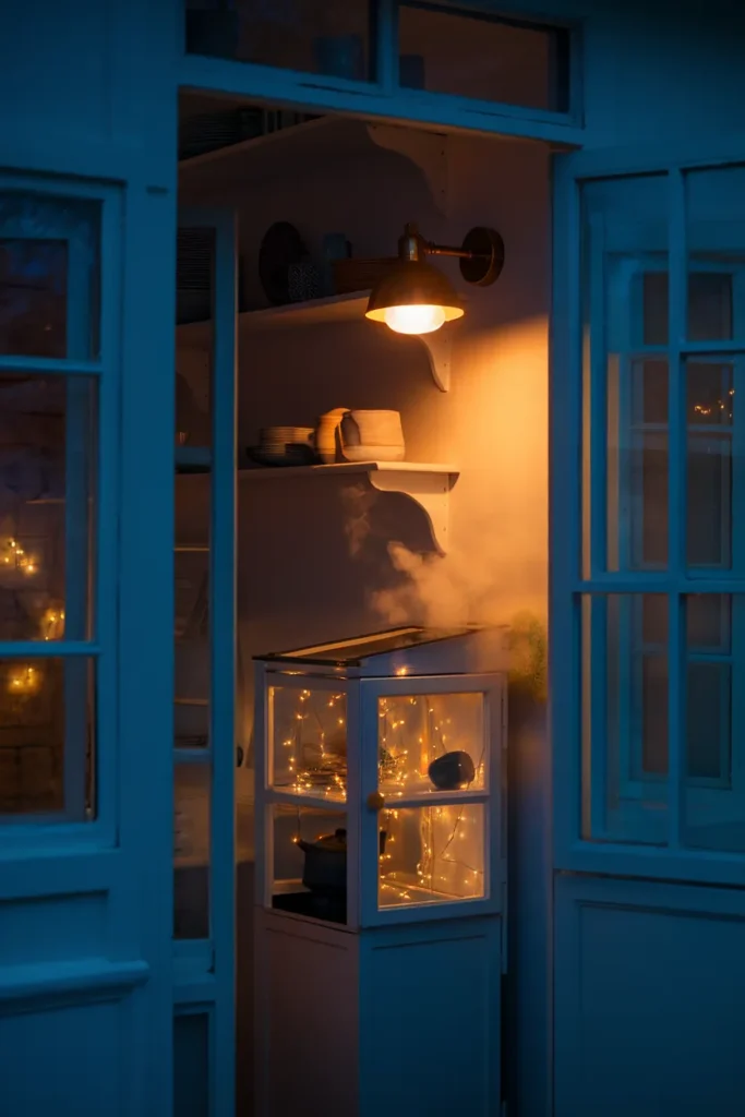
Here’s the highest-payoff swap in this whole article, and it costs about the price of two lattes. Bulb color is measured in Kelvin: lower numbers glow warmer and more golden, higher numbers run whiter and bluer. Around 2700K you get the warm tone of an old incandescent, and down near 1800K you’re in candlelight territory, which is exactly the glow every cottagecore photo you’ve saved is faking with editing. The Department of Energy breaks down the scale in this Department of Energy lighting color guide if you want the full science.
The honest trade-off: warm light is terrible for chopping onions. Lighting pros generally keep kitchen task light in the 3000K to 4000K range for visibility, so don’t warm-bulb your whole ceiling. Warm the decorative layer instead and put it on a dimmer or a smart plug.
| Light source | Bulb temp | Where it goes |
|---|---|---|
| Ceiling and task fixtures | 3000K to 3500K | over counters and the stove |
| Plug-in sconce or small lamp | 2700K | shelf wall, hutch, breakfast corner |
| Fairy lights, candle-look bulbs | 1800K to 2200K | inside a glass cabinet, dinner hour only |
One-line failure mode: a single leftover 5000K daylight bulb in the room flattens every pastel and makes the vintage layer look like a garage sale, so evict it first.
Renter-Safe Cottagecore Swaps: Zero Drill, Zero Deposit Risk
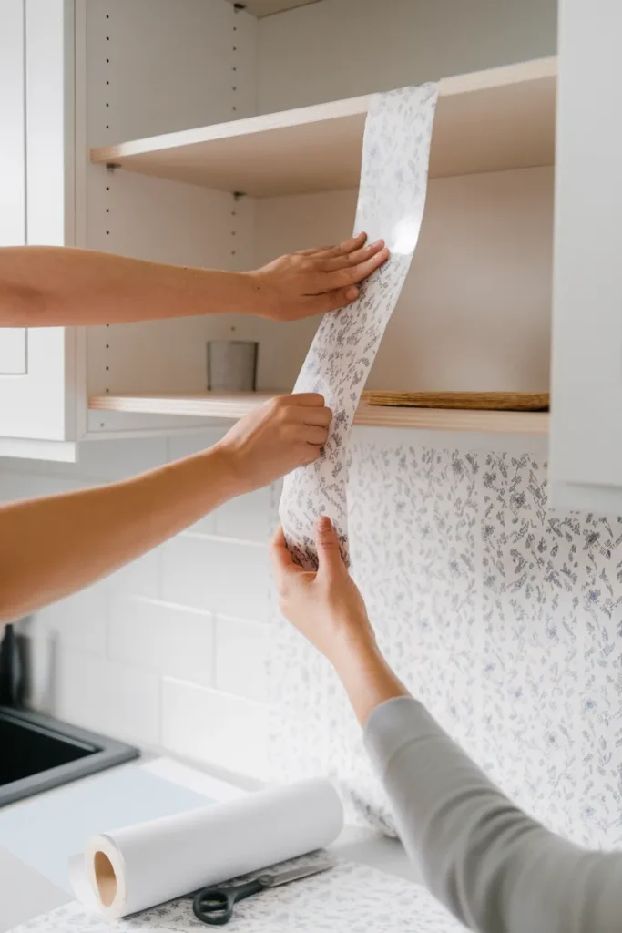
Everything in this section installs and uninstalls in an afternoon. Tension rods carry the cafe curtains. Adhesive utility hooks (the large ones are rated around five pounds) hang a copper pan, a market basket, or a string of dried oranges; just give freshly painted walls a couple of weeks before sticking anything to them. Peel-and-stick floral or check wallpaper runs about $20 to $40 a roll, covers somewhere near 30 square feet, and turns the inside of open shelving or one backsplash strip into the whole personality of the room.
Add a sink skirt attached with adhesive hook-and-loop tape instead of screws, a freestanding cart for the pastel layer (the IKEA RÅSKOG is the classic archetype, and any three-tier metal cart works), and a washable rug you can actually launder after soup night.
For the full small-space playbook, including what to do when the entire kitchen is one wall, start with these small cottagecore kitchen ideas for renters.
One-line failure mode: peel-and-stick applied to textured or freshly washed walls lifts at the seams within weeks, so smooth, dry, and dust-free is the whole game.
Dried Herbs, Copper, and the Working-Kitchen Layer
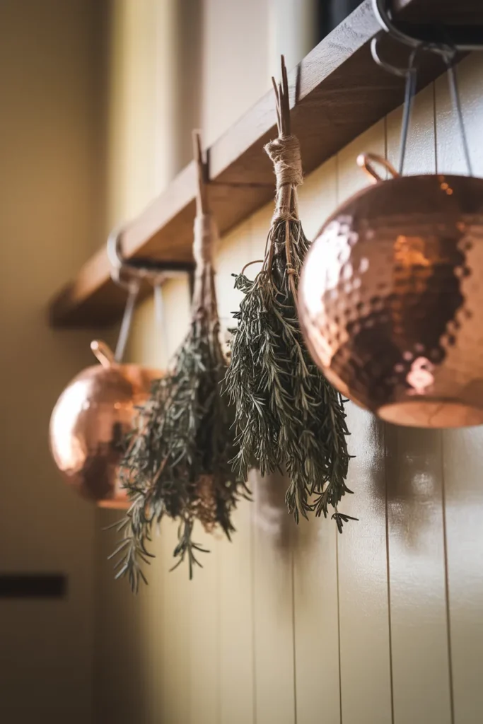
A cottagecore kitchen should smell like something. Hang small bundles of the sturdy herbs (rosemary, thyme, sage) from a rail or a peg and let them air-dry right where you’ll use them; brushing past rosemary on the way to the coffee pot is the cheapest aromatherapy in the house. Dry them indoors rather than in direct sun for better color and flavor, and remember dried herbs run three to four times stronger than fresh when you cook with them. The National Center for Home Food Preservation covers the details in this university guide to drying herbs.
Copper and cast iron belong in the same layer: cookware that lives out in the open because it’s genuinely used. One copper pot catching lamplight does more atmospheric work than a shelf of decor-only objects, and a cast iron skillet on a rail is both storage and set dressing. Stack your cookbooks on the counter like a TBR pile, spines out, bookmark ribbons showing.
One-line failure mode: fat bundles of tender, high-moisture herbs like basil and mint mold before they dry, so keep those bundles small and bag-dry them instead of displaying them.
When Pastel Isn’t You: The Moody Variant
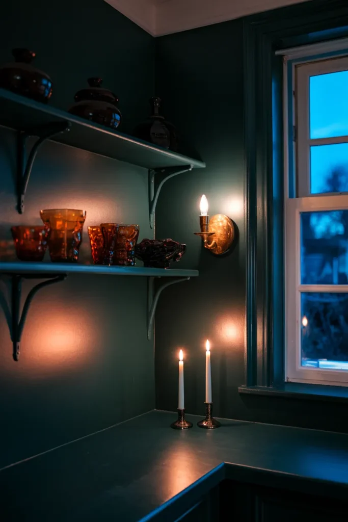
Not every cottage sits in a sunny meadow, and the same three layers work in reverse. Swap the pastel base for deep sage, forest green, or plum, keep the florals but let them go dark-ground (moody botanicals instead of sunny ditsy prints), and lean the vintage layer toward brass, amber glass, and candlelight. Pinterest search traffic for this variant has its own gravity right now.
The 2700K rule matters twice as much here, because dark walls swallow light; you’ll want one more warm source than you think. If that’s the direction pulling you, this dark cottagecore kitchen styling guide walks the whole moody version room by room.
One-line failure mode: dark walls with cool bulbs read basement, not library, so the paint and the bulbs have to change together.
Cottagecore Kitchen Decor FAQ
What is a cottagecore kitchen? A kitchen styled around a nostalgic, countryside way of living: natural materials, soft nature-drawn colors, floral pattern, vintage and handed-down objects, and food-making on display. It favors things that look used and loved over things that look new.
What’s the difference between cottagecore and farmhouse kitchens? Farmhouse leans clean, neutral, and structured (white shaker cabinets, black fixtures, apron sink). Cottagecore leans softer and more collected: pastels, florals, mismatched vintage china, candle-warm light. Farmhouse says efficient; cottagecore says storybook.
What colors work best for cottagecore kitchen decor? Sage green, cream, butter yellow, dusty rose, and soft blue, anchored by natural wood and one aged metal like brass or copper. The moody variant trades those for deep sage, forest green, and plum with amber accents.
How do I decorate a cottagecore kitchen on a budget? Start with the vintage top layer at thrift stores (plates often cost a dollar or two), add one floral cafe curtain on a tension rod, and swap your most visible bulb to 2700K. Those three moves typically total well under $50.
Can I do cottagecore kitchen decor in a rental? Yes, the whole look installs without a drill: tension rods, adhesive hooks, peel-and-stick paper, freestanding carts, sink skirts on hook-and-loop tape, and color carried in textiles and objects instead of paint.
Is cottagecore still in style in 2026? Yes. The style keeps splitting into thriving sub-looks (grandmacore, dark cottagecore, fairycore), which is what an aesthetic does when it has staying power rather than when it’s fading.
How do I keep cottagecore from looking cluttered? Use the one-in-three shelf rule, keep 2 to 3 inches of air around groupings, cap yourself at two floral scales per room, and make sure most displayed pieces earn their spot through actual use.
Start With One Layer
Pick the layer your kitchen is missing most and give it one weekend. For most renters that’s the vintage top, because it’s the cheapest and the most convincing; for most owners it’s the pastel base, because paint moves the whole room at once. Either way, screenshot the Three-Layer Rule, save this to your kitchen board so it’s there when you’re standing in the thrift aisle, and if your space runs small or your taste runs dark, the two guides linked above go deeper on both.
Keep reading
More cozy nook ideas
 Home Office
Read →
Home Office
Read →
Cozy Home Office Ideas: 10 Changes That Warm Up a Work Corner
Your desk is against a beige wall, under a ceiling light that makes everything look like a dentist’s waiting room, and you…
 By Room
Read →
By Room
Read →
Powder Room Ideas: Tiny Cottage Bathroom Charm
No bay window, no demo, no landlord conversation required. Most cottage powder room ideas you have saved were shot in a room…
 By Room
Read →
By Room
Read →
Floral Bathroom Decor That Stays Soft and Survives the Steam
Most floral bathroom decor fails in exactly two ways. The print is scaled for a dining room and you put it in…