
Floral Bedding Ideas for a Cottagecore Bedroom That Still Looks Right in Daylight

No painting. No drilling. No conversation with your landlord. Floral Bedding Cottagecore is the one cottagecore move you can make in an afternoon and undo before the lease ends, which is exactly why so many of us get it wrong. You buy the print you saw on a pin, put it on the bed, and the room reads busy instead of soft.
Five rules fix that. All five are below, plus a motif-scale table you can check against your own mattress, the two label specs that decide whether a print looks crisp or muddy, and a full build totaled at about $142 in real August 2026 prices.

The Five Rules, All On One Screen
Everything else in this article expands on these. Read them, screenshot them, go shopping.
- Give the print one white ground to breathe against. A floral needs a solid neighbor or the eye never gets to rest. Solid white sheets under a floral duvet is the cheapest version of this and it works every time.
- Size the motif to the bed, not to your phone screen. A flower that looks charming in a 600-pixel pin can look like wallpaper on a king. Aim for roughly eight motif repeats across the mattress width.
- Buy the fabric spec, not the photograph. Fiber content and weave decide whether the print holds a crisp outline or goes soft and slightly gray. The label tells you before you pay.
- Wash it once before you decide anything. Deep rose and botanical green are the two colors most likely to bleed. One wash tells you what you actually bought.
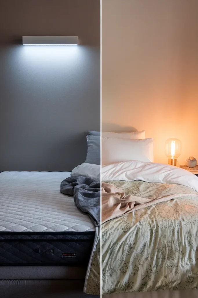
- Put the room at 2700K. Cool white bulbs drain the warmth out of every cottagecore palette. Warm light is what makes faded pink read as antique instead of dingy.
That’s the whole method. Now the parts that need explaining.
What Makes Bedding Read Cottagecore Instead of Just Floral
A floral print alone isn’t cottagecore. Grandmillennial chintz is floral. Hotel bedding is sometimes floral. So is a lot of 2007 shabby chic that most of us would rather forget.
Three things push a print into cottagecore territory:
The flower is a real, unglamorous one. Yarrow, cow parsley, clover, wild strawberry, forget-me-not, meadow grass. Cottagecore prints look picked, not arranged. A perfectly symmetrical rose bouquet reads formal. A slightly wonky sprig of something you’d find in a ditch reads cottage.
The color has been sun-faded on purpose. Cottagecore palettes sit one step down from saturated. Not sage, but sage that’s been washed forty times. Not rose, but rose that’s been left on a clothesline in July. Look at the deepest color in the print: if it still looks like it came out of a printer, the whole set will read costume.
There’s a hand somewhere in it. A scalloped quilt edge, a visible stitch line, a small embroidered detail, a ruffle that isn’t machine-perfect. One handmade signal is enough. Two is generous. Three starts to look like a craft fair.
Grandmillennial and dark academia both borrow from this vocabulary, so the line can blur. If you want the moodier end, that’s a real style with its own rules, and the archetype section below covers it.
Rule 1: Give the Print One White Ground to Breathe Against
Call this the One-Ground Rule. Every floral bed needs exactly one large, plain, light surface directly touching the print.
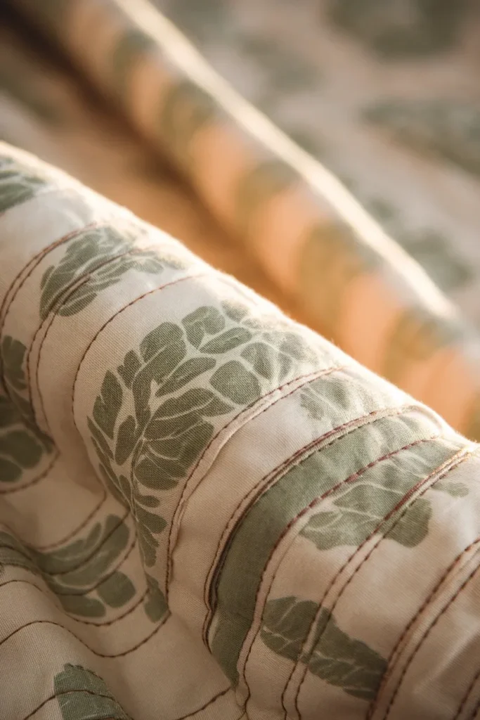
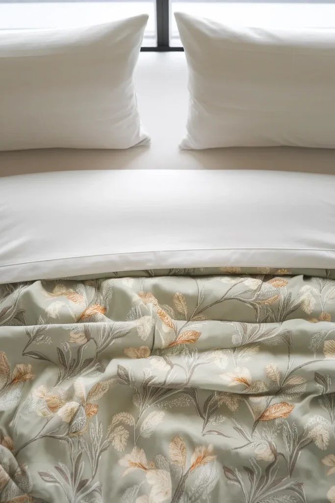
The easiest version costs nothing extra: solid white cotton sheets under a floral duvet, with the flat sheet folded back over the duvet edge by about eight inches. That white band does two jobs. It separates the print from your face at night, and it gives the eye a landing strip in every photo you’ll ever take of the bed.
If your floral piece is the quilt rather than the duvet, flip it. Put the quilt on top, folded back to the lower third of the bed, and let plain white cover the top two thirds.
What breaks the rule: floral sheets under a floral duvet with floral shams on top. Even in coordinating prints. The bed stops having a focal point, and a bed without a focal point is what “busy” actually means.
Small-room note: in a bedroom under about 120 square feet, the bed is already 40 percent of your visual field. Keep the white ground bigger than you think you need.
Rule 2: Size the Motif to the Bed, Not to Your Phone Screen
Here’s the thing nobody tells you: print scale is relative to the surface it sits on, and every pin you’ve ever saved was cropped.
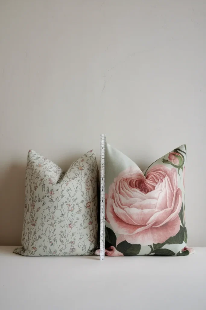
The working rule, which I’ll call the 8-Repeat Rule: a floral motif should repeat roughly eight times across the width of your mattress. Fewer than eight and the print reads as scattered blobs. More than about twenty and it collapses into a solid texture when you look from the doorway, which can be a deliberate choice but is rarely the one people intend.
Check it against standard US mattress widths:
| Bed size | Mattress width | Motif width that reads right | What that looks like | Skip |
|---|---|---|---|---|
| Twin | 38 in | under 2 in | Ditsy sprigs, tiny buds | Anything over 5 in |
| Twin XL | 38 in | under 2 in | Micro-floral, calico | Large cabbage roses |
| Full | 54 in | 2 to 4 in | Field flowers, small botanicals | Oversized tropical prints |
| Queen | 60 in | 3 to 6 in | Classic chintz sprays | Motifs so big only two fit across |
| King | 76 in | 5 to 8 in | Cabbage roses, big botanicals | Ditsy on its own |
That last row surprises people. On a king, a tiny ditsy print does not read as a floral at all. From six feet away it reads as speckled off-white, and you’ve paid for a pattern nobody can see. If you love ditsy and you have a king, put it on the shams and let a larger botanical carry the duvet.
The same scale logic applies anywhere a big soft surface takes a print, which is why it shows up again in styling a floral sofa in the living room, where the seat cushion is doing the job the mattress does here.
How to measure without a swatch: most product listings show the bedding on a queen. Find a recognizable reference in the photo, a standard pillow is 20 inches tall, and scale the flower against it.
Rule 3: Buy the Fabric Spec, Not the Photograph
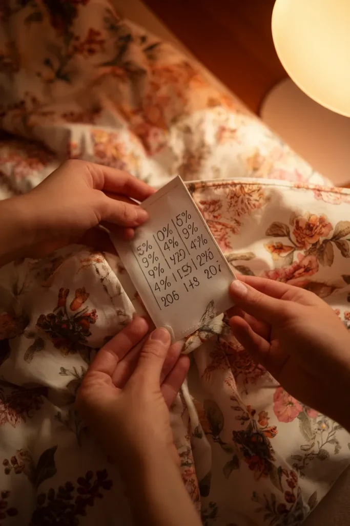
Two lines on the label predict how a floral print will look on your bed, and both of them are printed there by law.
Fiber content. Under federal rules, bedding including sheets, covers, blankets, comforters, pillows, pillowcases, quilts and bedspreads must disclose generic fiber names and percentages by weight, listed in descending order of predominance. That means “cotton rich” or “luxury blend” in the marketing copy is meaningless on its own, and the actual breakdown is sitting on the tag. You can read the federal fiber content labeling requirements yourself if you want the exact wording. Fibers under 5 percent can be lumped in as “other fiber,” so a 97 percent polyester sheet set can still get a soft-sounding name.
Why it matters for florals specifically: polyester microfiber takes print with a slightly bloomed, soft edge. On a bold graphic that’s fine. On a fine botanical line drawing, the stems thicken and the whole print loses its drawn quality, then goes faintly gray under warm lamp light. Cotton holds the outline.
Weave. Percale is a flat, matte, crisp weave, and it’s the one that keeps a delicate print looking drawn rather than photographed. It also makes a specific dry rustling sound when you get in, and it feels cool for the first ten minutes. Sateen has a soft sheen that bounces light back at you, which can make a busy floral look busier. Quilts and patchwork sit outside this question entirely because the piecing carries the texture.
The honest trade-off: cotton percale wrinkles, visibly, permanently, from the second you sit on it. If a smooth bed matters more to you than a crisp print, buy the blend and accept the softer flower. There’s no version where you get both.
Rule 4: Wash It Once Before You Decide Anything
This is the step that separates bedding that ages well from bedding you quietly replace in eight months, and I have not seen a single competing article mention it.
Saturated cottagecore prints are exactly the risk category. Deep rose, botanical green, indigo, anything with a dark ground. Iowa State University Extension explains how dye bleeding and crocking happen and gives the test that costs you nothing: wash the piece alone the first time, per its label, and look at the water. If the water is tinted, you have excess dye and you’ll need more washes before it stops migrating onto your white sheets.
Two corrections worth knowing, both from that same source:
- Vinegar and salt do not set dye. They never did. This is one of the most repeated pieces of laundry folklore on the internet and it isn’t true for commercially dyed fabric.
- Actual fixatives need heat. Retayne, a cationic dye fixative used as a pretreatment on cotton that bleeds, needs water at 140°F to work. Rit ColorStay works the same way. Color-catcher sheets are the low-effort version: they trap loose dye in the wash rather than fixing it in the fabric.
Failure mode if you skip this: you put a deep rose floral duvet on white percale sheets, sleep on it for a week, and the sheets come out of the next wash with a faint pink cast that will not come back out. The One-Ground Rule from earlier stops working, because your white ground isn’t white anymore.

Rule 5: Put the Room at 2700K or the Flowers Go Gray
Color temperature does more for a cottagecore palette than any single object you can buy, and it’s the cheapest fix on this list.
Warm white bulbs at 2700K push the yellow-red end of the spectrum, which is what makes faded pink read as antique and sun-warmed sage read as sage rather than institutional green. Cooler bulbs at 4000K and up flatten every muted color in the room. A GE Relax HD A19 4-pack at 2700K runs $12.98 at Home Depot as of August 2026, which makes this a twelve-dollar upgrade to the entire look.
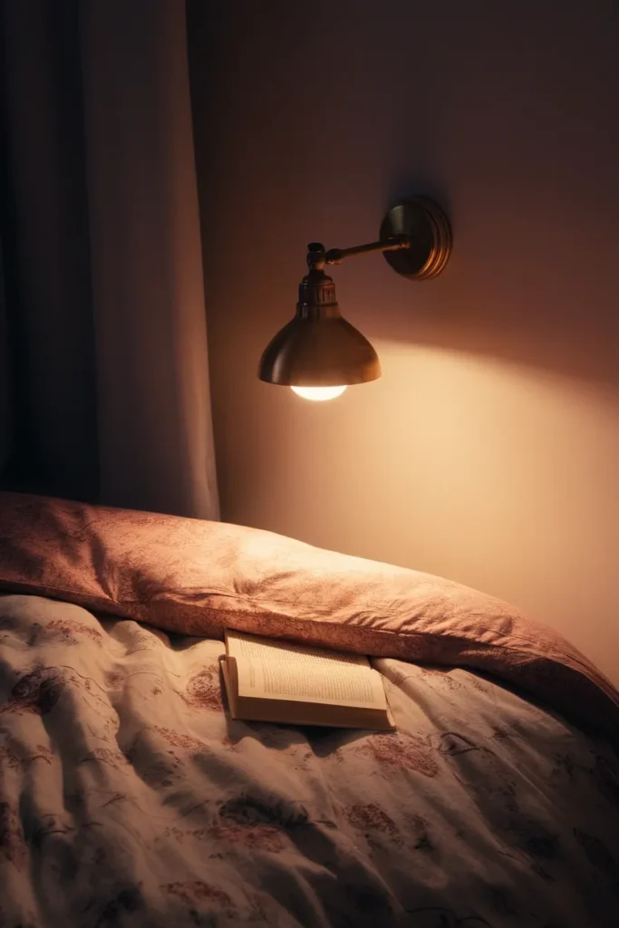
Placement matters as much as temperature. Get the light source below eye level when you’re sitting up in bed. A swing-arm wall sconce, a small table lamp, a plug-in picture light over the headboard. Overhead light coming straight down flattens the quilting on a floral quilt and kills the texture you paid for.
Add a dimmer or a smart bulb if you read in bed. The same floral duvet reads fresh and garden-like at full daylight and dim and candlelit at 20 percent, which is a genuinely useful thing for one purchase to do.
If the bed is your main reading spot, the lighting logic overlaps almost entirely with these bedroom reading corner setups, which go deeper on lamp height and arm’s-reach distances.
Three Cottagecore Floral Bedding Looks, and Who Each One Is For
Pick one and commit. Mixing two of these is how rooms end up looking undecided.
The Wildflower Meadow
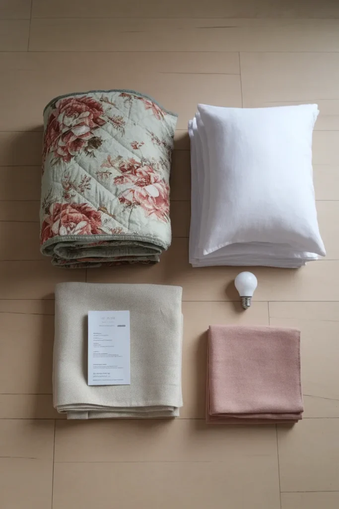
Palette: chalk white ground, sage, ochre, faded cornflower. Print: ditsy to small botanical, 2 to 4 inches, meadow species rather than roses. Layers: white percale sheets, floral duvet, a folded oatmeal linen throw across the lower third, one plain white lumbar pillow. Who it’s for: small, bright rooms with white walls, especially renters who can’t paint. It’s the most forgiving of the three because the white ground does most of the work. Where it goes wrong: adding a jute rug, dried stems, a wicker basket and a macrame hanging until it tips from cottage into a farm-stand display.
Dark Cottagecore
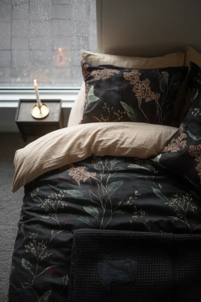
Palette: ink, deep moss, oxblood, aged brass accents. Print: medium to large botanical on a dark ground, 4 to 8 inches. Layers: cream or oatmeal sheets rather than bright white (bright white against a dark ground reads sporty), dark floral duvet, a heavy wool throw, one velvet bolster. Who it’s for: north-facing rooms that never get direct sun, and anyone whose TBR pile leans gothic.
Pinterest’s own autocomplete now suggests “dark floral bedding for dark cottagecore bedroom,” and the moody end of the aesthetic is climbing fast. Pinterest’s Spring 2026 trend report clocked “dark cottagecore kitchen” up 915 percent year over year. Where it goes wrong: dark bedding plus dark walls plus one weak overhead bulb. This look needs more light sources than the pale one, not fewer.
Faded Rose
Palette: antique cream, dusty rose, soft taupe, tarnished gold. Print: classic chintz sprays or cabbage roses, 4 to 8 inches, deliberately washed out. Layers: cream sheets, floral quilt with a scalloped edge, a second quilt folded at the foot, ruffled or lace-edged shams. Who it’s for: the grandmillennial crossover, and anyone with an inherited quilt they want to build around. Where it goes wrong: too much matched ruffle. Ruffle on the shams or ruffle on the bed skirt, not both.
A canopy is the single biggest upgrade to any of the three, and it doesn’t have to mean holes in the ceiling. These cottagecore canopy bed looks sorted by drilling include no-drill versions that hold under half a pound of fabric.
The $142 Version, Totaled Out
Not “affordable.” An actual list with actual numbers, priced August 15, 2026, for a queen bed.
| Item | Where | Price | Verified? |
|---|---|---|---|
| Floral Cottage Botanical Quilt Set (quilt plus shams) | Kohl’s | $49.99 | Verified, seen Aug 15 2026 |
| Solid white cotton percale sheet set, queen | Walmart or Target house brand | about $35 | Estimate, product page unavailable |
| Oatmeal linen-blend throw for the foot of the bed | Any big-box home section | about $25 | Estimate |
| One plain lumbar pillow in gingham or ticking | Any big-box home section | about $19 | Estimate |
| GE Relax HD A19 LED 4-pack, 2700K | Home Depot | $12.98 | Verified, seen Aug 15 2026 |
| Total | about $142 |
Two of those five line items are labeled estimate because the retailer pages wouldn’t load a live price at the time of writing. The two verified numbers are the ones the build actually hinges on.
The wider price reality, from live US listings on August 15, 2026:
- Macy’s Cottage Classics Field Floral Comforter Set: $52.25, marked down from $95
- Threshold Full/Queen Floral Scallop Comforter and Sham Set at Target: $69.00
- Urban Outfitters Catlyn Floral Patterned Duvet Cover Set: $59.00, marked down from $79
- Home Depot Cozy Line Country Floral Chic Scalloped Patchwork 3-Piece Quilt Set: $76.92
- Home Depot Laura Ashley Amberley Reversible Quilt Set: $128.69
- Lulu and Georgia Blossom Floral Block Print Quilt: $312.00
So the honest band: roughly $35 to $130 gets you mass-market floral bedding, and $130 to $320 is where boutique and designer starts. Anything under $35 for a full set is almost always polyester microfiber, which loops back to Rule 3.
Discounting is heavy and constant in this category. Several of the sets above were showing 40 to 65 percent off on the same day. Paying full price for mass-market floral bedding is close to optional.
Five Ways Floral Bedding Goes Wrong
- Every layer has a print on it. No white ground, no rest. Fix: strip back to one floral surface.
- The motif is the wrong size for the bed. Usually ditsy on a king. Fix: check the 8-Repeat table above before you buy.
- The colors are one notch too saturated. They looked right on a backlit screen and read like a costume in daylight. Fix: shop the faded version of the same print.
- Cool white bulbs. Everything muted turns slightly dirty. Fix: $12.98 and ten minutes.
- You skipped the first solo wash. Now the white sheets are pink. Fix: there mostly isn’t one, which is why Rule 4 exists.
Floral Bedding Cottagecore FAQ
What are the trendy bedding styles for 2026? On the cottagecore side, the moody end is where the growth is. Pinterest’s Spring 2026 trend report shows “dark cottagecore kitchen” up 915 percent and “grandma core kitchen” up 545 percent, and Pinterest’s own search autocomplete now suggests “dark floral bedding for dark cottagecore bedroom.” Scalloped quilt edges, mismatched shams, and vintage-look botanical prints on cream grounds are the other consistent signals across current listings.
What are the latest trends in floral sheets? Small-scale field-flower prints on white or cream grounds, sold as separates rather than matched sets so you can mix a floral sham with plain sheets. Green-dominant palettes are notably common in current cottagecore listings, and “cottagecore bedding green” is one of Pinterest’s top autocomplete suggestions for the category.
What patterns look good with florals? Gingham, ticking stripe, and small checks, in that order. The rule is contrast of geometry, not contrast of color: pair an organic curved print with a straight-line geometric one, keep them in the same palette, and vary the scale so one is clearly smaller than the other. Avoid pairing two florals of similar size, which is the single most common mistake.
How do you make floral bedding look expensive? Three things do most of the work. Natural fiber content, which you verify on the label rather than in the description. Generous sizing, meaning a duvet that hangs at least 10 to 12 inches down each side rather than sitting flat on top. And ironing or steaming just the top fold, which is the only part anyone sees.
What is dark cottagecore bedding? Cottagecore’s moody counterpart: large-scale botanical prints on ink, charcoal, or deep moss grounds, paired with cream rather than bright white sheets, heavier textures like wool and velvet, and aged brass rather than gold. It suits north-facing rooms that never get direct sun, and it needs more lamps than the pale version, not fewer.
What size floral bedding should I buy for a queen bed? For the print itself, a motif between 3 and 6 inches wide across a 60-inch mattress. For the piece, check the listed dimensions rather than trusting the size name, since “queen” duvet covers vary by brand. You want at least 10 inches of overhang on each side so the print drapes instead of sitting flat.
Does floral bedding work in a small bedroom? Yes, and it’s often the only decor lever a renter has. Keep the print small to medium, keep the ground pale, and keep everything else in the room plain. In a room under about 120 square feet the bed is most of what you see, so let the bedding be the entire design decision and leave the walls alone.
Start With the Ground Color
If you only take one thing from this: decide your ground color first, then shop for the flower. Pale ground for a small or dark room, dark ground for a room that already gets good light. Everything else, scale, fiber, layers, follows from that one call.
Then go check the bulb in your bedside lamp. It’s the cheapest thing on the list and it changes the most.
Next up, if the bed is also where you read: the lighting heights and arm’s-reach distances that make a bedroom corner one you’ll actually sit in.
Keep reading
More cozy nook ideas
 Bedroom
Read →
Bedroom
Read →
English Cottage Bedroom Checklist: Everything to Decide Before You Start
You saved forty pins of floral quilts and sloped ceilings, then looked up at your own bedroom: beige walls, one window, a…
 Bedroom
Read →
Bedroom
Read →
21 Small Bedroom Ideas for Couples
Sixty-two and a quarter inches. That’s the width of a common IKEA queen storage frame, and in a 10 by 10 foot…
 Bedroom
Read →
Bedroom
Read →
Bedroom Reading Corner Ideas: 10 Nook Setups You Will Actually Sit In
Your bedroom corner is probably holding a laundry chair and a phone charger right now. Bedroom reading corners fail for one reason…
One Comment